Design as Code: A Developer's Tour of Penpot
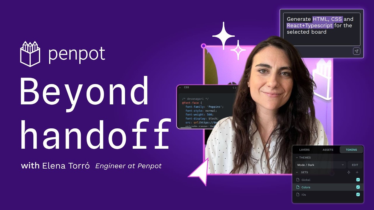
🔗 **Source:** [Design as Code: A Developer's Tour of Penpot](https://www.youtube.com/watch?v=fkuBHeONcEk)
> [!note]+ Document Notes
> tags: [penpot, design-to-code, design-tokens, mcp-servers, open-source-design-tools, self-hosting, design-systems, ai-agent-context, inspect-mode, flexbox-grid-parity, vendor-demo, figma-alternative]
> author: Penpot
> source: youtube.com
> reference: https://www.youtube.com/watch?v=fkuBHeONcEk
> date created: 2026-09-03 08:20
>
> > [!info] Generated analysis — not the author's words. Sections below are machine-written
> > from the captured source. Only text inside `> [!quote]` blocks is verbatim from the author.
> > Do not quote or attribute any other line to the named author.
>
> > [!warning] Read this first
> > **Vendor content.** Published on Penpot's own channel (uploaded 2026-09-03, 5:14, 58 views at capture). The video description names the presenter as Elena Torró, Software Engineer at Penpot; the captions never state her name. Every evaluative claim ("enforces correct code structures," "lower token usage, lower costs," "the first design platform I can really trust") is the company describing its own product. Nothing is demonstrated with numbers; the on-screen demo isn't in the captions.
> > **Thin source.** 775 caption words across 11 transcript blocks, with `[music]` markers throughout. This is a scripted product tour, not an argument, so several sections below are short by design.
> > **ASR artifacts.** "Along say" (≈ "I'd also say"), "specially interesting" (≈ "especially"), "structure semantic information" (≈ "structured"), "abstract proprietary design concepts" reads as scripted, not misheard. Quotes are left as captured.
> > **Links.** The captions contain no `<a href>` links. The four technical links below come from the YouTube description, not the transcript, and none were fetched for this note.
>
> # 🏷️ Title: Design as code: a developer's tour of Penpot [2026]
>
<!-- deep-read:sections start -->
## 🧭 Table of Contents
- [📝 Summary](#-summary)
- [📖 Main Content](#-main-content)
- [🗒️ Notes](#️-notes)
- [📚 References](#-references)
- [🗣️ Paraphrase](#️-paraphrase)
- [📰 Newsletter](#-newsletter)
- [✅ Action Items](#-action-items)
- [🧪 Hypotheses](#-hypotheses)
- [📊 Methodology](#-methodology)
- [❓ Questions](#-questions)
- [🔮 Future Research](#-future-research)
- [💡 Implications](#-implications)
- [🧠 Learning Styles Assessment](#-learning-styles-assessment)
- [📊 Accessibility Assessment](#-accessibility-assessment)
- [🌍 DEIB Assessment](#-deib-assessment)
- [✅ Logical Validity](#-logical-validity)
- [🛡️ DARVO Analysis](#-darvo-analysis)
- [🎯 Conclusion](#-conclusion)
### 🔗 References
- Source: https://www.youtube.com/watch?v=fkuBHeONcEk (Penpot channel, 2026-09-03, 5:14)
- From the description (not fetched): Penpot MCP server `github.com/penpot/penpot/tree/develop/mcp` · Penpot AI Kit `github.com/penpot/penpot-ai-kit` · W3C Design Tokens Community Group, Format Module 2025.10 `designtokens.org/tr/2025.10/format/` · docs `help.penpot.app`
- Description chapter markers: 00:25 Inspect mode · 01:02 Flex/Grid parity · 01:48 design tokens · 02:24 components and variants · 02:42 plugins, API, webhooks · 02:59 MCP server · 03:48 AI Kit · 04:00 self-hosting
## 📝 Summary
**What this is.** A five-minute scripted tour of Penpot, the open-source design tool, narrated from a developer's seat. The thesis is the opening line: Penpot is "built for where product development is heading," and the three markers of that direction are open standards, shared systems, and structured data that AI agents can read.
**The six claims, in the order made.**
1. *Inspect mode shows code, not pixels.* A selected component exposes its implementation because Penpot "expresses visual artifacts as declarative and semantic design." The claimed payoff is no more "translating a design by eye."
2. *Layout primitives are the browser's.* "Flex layout behaves like flexbox, and grid layout behaves like CSS grid," so the design's layout model and the implementation's layout model are the same model. Formats are "SVGs, HTML, CSS, and JSON."
3. *Design tokens follow the W3C Design Tokens Community Group spec,* so colors, spacing, typography, and themes are a shared system rather than tool-local settings.
4. *Components and variants map to front-end component thinking.*
5. *Extensibility now includes an MCP server,* framed as a "three-party collaboration model: designers, developers, and AI agents." Agents read "components, layouts, tokens" as structured context "instead of screenshots and prompts." An "AI kit" is said to cut token usage and let "even smaller models" handle complex tasks.
6. *Self-hosting via Docker, Docker Compose, or Kubernetes* delivers "data sovereignty" and independence from vendor lock-in.
**Bottom line.** The interesting claim isn't any single feature. It's the frame: a design file is a structured document, and once it is, three consumers (a developer's inspect panel, a token pipeline, and an AI agent's context window) read the same data. That frame is correct and applies to any tool that stores design as declarative data; whether Penpot's implementation delivers it is not shown here. The two verifiable anchors are the W3C DTCG format (a public spec) and the MCP server (public source). Everything else is a vendor's word.
## 📖 Main Content
**Structure.** Six feature beats, each a sentence of claim plus a sentence of "why a developer cares." No comparison to Figma is spoken, but the whole script is shaped against Figma's known pain points: proprietary file format, auto-layout that only approximates flexbox, tokens as a plugin ecosystem rather than a core object, cloud-only hosting. Naming none of them keeps the tone positive and leaves the viewer to supply the contrast.
**The "design as code" claim, precisely.** The script's strongest technical statement is that Penpot's layout engine and CSS share semantics: "Flex layout behaves like flexbox, and grid layout behaves like CSS grid." If true (Penpot has documented this since its 2.0 release, but this note didn't verify), it means a designer's constraints are already valid CSS constraints, which eliminates a class of handoff bugs where a design uses a layout rule the browser doesn't have. That is a real, checkable engineering property, and it's the one claim in the video a developer could test in ten minutes by building a layout and reading the inspect output.
**The token claim.** "Natively supports design tokens using the W3C design tokens community group specification." The DTCG format is an open JSON format with a 2025.10 revision (linked in the description). Native support would mean tokens export in a format that Style Dictionary, Tokens Studio, and theme.json converters can consume without a plugin. The video asserts it and shows an asset panel; it doesn't show an export.
**The MCP claim, and what it changes.** The argument is that AI coding assistants working from screenshots guess at structure, while an MCP server exposes the structure directly. That's the same argument Figma made for its Dev Mode MCP server and the same argument the WordPress Design System MCP server makes for `@wordpress/components`. The genuinely new sentence is about cost: providing "the right context efficiently" means "lower token usage, lower costs, and allowing even smaller models to handle complex tasks." That is a testable claim with no test shown. Structured context is usually smaller than a screenshot's worth of tokens, so the direction is plausible; the magnitude is unknown.
**Trust language.** "The design interface enforces correct code structures" and "Penpot is the first design platform I can really trust as a developer" carry the script's persuasive weight. "Enforces" is the word to probe: a design tool can constrain designers to expressible layouts, but it can't enforce accessible markup, semantic HTML element choice, or responsive behavior at breakpoints the designer didn't draw. The inspect panel emits CSS for a fixed artboard; it doesn't emit a component.
**Self-hosting.** The one section with no hedge and no need for one: Penpot is AGPL-licensed and ships Docker Compose and Kubernetes deployment paths. "Data sovereignty" is a compliance selling point aimed at the enterprise and public-sector buyers who can't put design files in a US cloud.
**What's absent.** No pricing, no mention of Penpot's own hosted cloud tier's terms, no accessibility features (contrast checking, annotation), no versioning or branching story, no plugin count, no comparison of MCP tool coverage against Figma's. The closing line, "I can't think of going back to an era where design tools are closed and proprietary," is a values statement, and it's the honest center of the pitch.
## 🗒️ Notes
- **Second Penpot source in two days.** A Penpot item was in the 2026-09-02 fable/penpot/voxcpm batch. Check that note before writing atoms so the two don't produce duplicate Permanent candidates on "structured design data serves three consumers."
- **The MCP-server-as-handoff pattern is now a cluster.** Figma Dev Mode MCP, Penpot MCP, the WordPress Design System MCP server in Courtney's own toolchain, and Miles (today's Repository and Pantheon-livestream notes) all move design intent into agent context as structure. The differences are what gets exposed (tokens vs components vs full canvas) and who owns the schema. That comparison is a post; this video is one data point in it.
- **Flexbox/grid parity is the one thing to actually test.** It's the sole claim a reader can falsify in minutes. If it holds, the "design as code" tagline is earned for layout; if the inspect output diverges from the canvas at any breakpoint, the tagline is marketing.
- **"Even smaller models" is the cost-routing hook.** If structured design context lets a small model do what a large one needs a screenshot for, that's the same argument as the credit-routing rule "fix the context before escalating the model." Worth an experiment with the Penpot MCP against a WordPress block pattern build.
- **No accessibility beat at all.** A developer-facing tour of a design tool in 2026 that never says the word is a gap worth naming, especially given the token and component story would make automated contrast and spacing checks trivial to surface.
- **Presenter attribution.** Author is set to the channel (Penpot). The description credits Elena Torró; the captions don't. Cite her only via the description.
## 📚 References
- Penpot, *Design as code: a developer's tour of Penpot [2026]*, YouTube, 2026-09-03. Presenter per description: Elena Torró, Software Engineer at Penpot.
- W3C Design Tokens Community Group, *Design Tokens Format Module 2025.10* (linked in description; the spec is public and citable independent of Penpot).
- Penpot MCP server and Penpot AI Kit repositories (linked in description; not read for this note).
- Cross-reference in Reader: Andy Peatling / Miles (Repository, 2026-09-03) and the Pantheon livestream demo (2026-09-03), both on AI agents consuming design structure for WordPress.
- Cross-reference: WordPress Design System MCP server (`@wordpress/components`, `@wordpress/ui`, `--wpds-*` tokens) in Courtney's toolchain, the WordPress-side analogue of the Penpot MCP.
## 🗣️ Paraphrase
Penpot stores a design as structured data, not a picture. Click a component and you see its CSS, HTML, and SVG. Its layout tools are flexbox and grid under other names, so what the designer builds is already something the browser can do. Tokens follow the W3C format, so colors and spacing live in one shared system. There's an API, plugins, webhooks, and now an MCP server, so an AI assistant can read the same structure a developer reads instead of guessing from a screenshot, and the company says that costs fewer tokens. You can run all of it yourself with Docker or Kubernetes. The presenter's closing point: once your design tool is open and structured, you won't go back to a closed one.
## 📰 Newsletter
**Penpot pitches the design file as agent context.** In a five-minute developer tour, the open-source Figma alternative makes one argument six ways: a design stored as declarative data (flexbox and grid layouts, W3C-format tokens, components with variants) can be read by an inspect panel, a token pipeline, and now an AI agent through an MCP server, all from the same source. The claimed payoff for agents is fewer tokens than screenshots and workable results from smaller models. None of it is measured on screen. The checkable parts are the W3C token spec and the public MCP source; the flexbox/grid parity claim is a ten-minute test any developer can run. For WordPress builders the parallel is direct: theme.json is a token system, block patterns are components, and the WordPress Design System MCP server plays the same role on the implementation side. The gap between the two is a converter nobody has shipped yet.
## ✅ Action Items
**DevRel**
- Vendor tours that name the competitor's pain points without naming the competitor are a reusable script shape: positive tone, contrast supplied by the viewer. Note the technique for product-adjacent talks. `#action/h4`
- The one falsifiable claim (flexbox/grid parity) is the demo a DevRel should lead with; the script buries it at 1:02. `#action/h3`
**OSPO**
- Penpot is AGPL with a hosted cloud tier and a self-host path; it's a live example of the open-core-without-open-core model (same code, hosting as the product). Relevant to any FAIR or hosting-neutrality discussion. `#action/h4`
**Community**
- Not applicable to this source.
**WordPress teams** (Core, Core Performance, Core AI, Core Program Team, Mobile, Playground, Community, Training, Marketing, Support, Design, Documentation, Photos, TV, Polyglots, Accessibility, Meta, CLI, Hosting, Tide, Openverse, Themes, Plugins)
- **Design:** DTCG-format tokens to theme.json is a converter WordPress doesn't have; Penpot's native DTCG export (if it exists as claimed) makes it a concrete project. `#action/h3`
- **Core AI:** the Penpot MCP and the WordPress Design System MCP are two halves of a design-to-block pipeline; a sanctioned experiment wiring them through Claude Code or Codex would produce the first real "design as code for WordPress" demo. `#action/h3`
- **Themes:** flexbox/grid parity means a Penpot layout maps to Group and Grid block layout attributes with fewer translation steps than a Figma auto-layout does. Worth a handbook note if verified. `#action/h4`
- **Accessibility:** the tour never mentions accessibility. Any WordPress-side integration should add contrast and touch-target checks on the token layer, since Penpot doesn't surface them here. `#action/h4`
- All other teams: not applicable to this source.
**The WPOCC**
- Not applicable to this source.
**FAIR**
- Not applicable to this source.
**Personal (Courtney)**
- **Test the parity claim before citing it.** Open Penpot, build a two-column flex layout with a gap, read the inspect CSS, and compare to the canvas at a narrower frame. Ten minutes; converts the tagline from claim to fact or marketing. `#action/h2`
- **Wire the two MCPs once.** Penpot MCP as design source, WordPress Design System MCP as component target, one block pattern as output. Whatever happens is a Field Notes post and a direct answer to Peatling's "agents don't recommend WordPress" line from today's Repository note. `#action/h2`
- **Merge with yesterday's Penpot note** before creating atoms; the "one structured source, three consumers" idea should be one Permanent note, not two. `#action/h3`
## 🧪 Hypotheses
1. **Structured design context beats screenshots on token cost by a large factor.** A component tree with tokens is text; a 1440-px screenshot is ~1,500 image tokens plus whatever the model hallucinates about spacing. Testable with one component and two prompts. *Vendor asserts; magnitude unknown.*
2. **Layout-primitive parity removes a whole class of handoff bugs but not the biggest one.** Spacing and alignment bugs drop; semantic HTML, responsive behavior between drawn breakpoints, and interaction states remain, because a design tool has no place to express them. *Prediction from the mechanism, not from the video.*
3. **Design-tool MCP servers converge on a shared schema within two years or fragment into vendor lock-in by another name.** Figma, Penpot, and Sketch each exposing different tool surfaces reproduces the proprietary-format problem one layer up. The DTCG spec is the precedent for convergence; MCP tool naming has no such body yet. *Speculative.*
4. **Self-hosting is the actual purchase driver for Penpot's enterprise tier, not the AI story.** Public-sector and regulated buyers pay for sovereignty; AI features are table stakes. *Inference from which section carries no hedge.*
## 📊 Methodology
Scripted vendor tour. Method is assertion plus on-screen demonstration; the captions carry the assertions and none of the demonstration, so this note can evaluate only the claims. No benchmarks, no user counts, no comparison. Chapter markers in the description show the script was planned as six beats of roughly 40 seconds each. Fair assessment: the video does what a product tour is for, and doesn't pretend to be evidence. The one methodological problem is the word "enforces," which promises a guarantee the described mechanism can't deliver.
## ❓ Questions
- Does Penpot's inspect output change when the artboard is resized, or is it fixed-frame CSS? (Determines whether "design as code" covers responsive design.)
- Which DTCG version does the export target, and does it round-trip (import edited tokens back)?
- What does the MCP server expose: read-only canvas, tokens only, or write access? Write access changes the security model entirely (see today's Rank Math and Core Security Initiative notes on agents with broad permissions).
- Where does the "smaller models" claim come from: an internal eval, a customer anecdote, or reasoning from token counts?
- Who is the tour for? The script says "developers," but the sovereignty section is written for a procurement officer.
## 🔮 Future Research
- A side-by-side of Figma Dev Mode MCP and Penpot MCP tool surfaces: what each exposes, what each lets an agent change.
- A DTCG-to-theme.json converter and its inverse; measure how much of a real block theme survives the round trip.
- Token cost measurement: same component, screenshot prompt vs MCP context, three models, task success and cost.
- The sovereignty market for design tools: who actually self-hosts Penpot and why (compliance, cost, or ideology).
## 💡 Implications
**For design-to-development handoff.** If layout parity holds, the handoff conversation shifts from "what did you mean here" to "which breakpoints did you not draw." That's progress, and it's also where the remaining bugs will live.
**For AI-assisted front-end work.** The video's frame is the correct one: the quality of an agent's output is bounded by the structure of its input. A design file that's already declarative data is a better prompt than any prompt. This is the same conclusion as today's Miles notes from the other direction (Peatling built structure into the agent because the design source didn't have it).
**For WordPress.** theme.json was a token system before "design tokens" was a mainstream term, and block patterns are components. What's missing is the bridge from any design tool's structured output to those two things. Penpot's open format makes it the easiest tool to build that bridge against, which is an argument for the WordPress Design team to look at it regardless of whether designers adopt it.
**For open source strategy.** Penpot is an existence proof that an open-source tool can lead on a new integration surface (MCP) rather than follow. The AGPL-plus-hosting model funds it. Whether it holds when the incumbent ships the same feature with 100× the users is the open question.
## 🧠 Learning Styles Assessment
- **Visual:** the primary mode; the whole argument is shown on screen. Caption-only readers (and this note) get the claims without the evidence.
- **Auditory:** scripted narration at a steady pace, music bed throughout; clear for listeners, no jargon undefined except "MCP server."
- **Reading/writing:** the description's chapter list plus four links is a decent reading path; the video itself has no on-screen text in captions.
- **Kinesthetic:** none in the video, but every claim is a five-minute hands-on test, which is the video's real strength for this learner.
- **Logical:** claim, mechanism, payoff, six times. Satisfying structure; thin on evidence.
- **Social:** solo narration; no user voices.
- **Solitary:** fits a developer evaluating tools alone.
- **Verbal:** the "three-party collaboration" phrase and "design as code" tagline are memorable and repeatable.
## 📊 Accessibility Assessment
Auto-captions only, with `[music]` markers and at least three misheard phrases; no human captions or transcript are linked. A five-minute music bed under narration hurts comprehension for viewers with auditory processing difficulty. The description's chapter markers help navigation. Content-wise, the tour never mentions accessibility features, contrast checking, or annotations, which is the more important gap: a "design as code" story that omits the accessibility layer of that code is incomplete, and the token system it describes is exactly where automated checks would sit.
## 🌍 DEIB Assessment
One presenter, a woman engineer at the company, which is worth noting in a category (developer tooling demos) where that's still uncommon. No user voices, so no diversity of perspective to assess. The sovereignty section speaks to organizations outside US cloud jurisdictions, a global-audience awareness most US-made tool demos lack. Language is English only; auto-captions only, so non-native readers get the ASR errors too. No claims that bear on inclusion beyond the self-hosting access argument (organizations that can't use SaaS can still use the tool).
## ✅ Logical Validity
**Argument form.** Open standards + shared systems + structured data → a tool AI agents and developers can both use → therefore adopt Penpot. The first arrow is sound in the abstract: structured, standard data is more consumable than proprietary binary. The second arrow needs Penpot's implementation to actually be structured, standard, and complete, which is asserted, not shown.
**Fallacies present.**
- *Unfalsifiable superlative:* "the first design platform I can really trust as a developer." Personal, unmeasured, and the speaker is an employee.
- *Equivocation on "enforces":* constraining a designer's canvas to flex/grid semantics isn't enforcing correct code; the code the developer ships is still the developer's.
- *Unsupported quantitative claim:* "lower token usage, lower costs, and allowing even smaller models." Direction plausible, no measurement.
- *Implied comparison without a comparator:* every pain point is Figma's; Figma is never named, so no claim can be checked against it.
**Fair grade.** As a product tour, honest about what it is. As an argument for adoption, valid in form and unsupported in premises. The self-hosting claim is the only one that stands on its own.
## 🛡️ DARVO Analysis
Not applicable in the strict sense; no accusation, no reversal, no victim framing. The closest move is the closing line's implied indictment of "closed and proprietary" tools as the era we're leaving, which positions the incumbent as the problem without engaging any of its counterarguments (ecosystem size, plugin depth, collaboration maturity). That's ordinary competitive framing, not a defensive reversal.
## 🎯 Conclusion
A well-made, honest-about-its-genre vendor tour that carries one durable idea: a design file stored as declarative, standards-based data serves the developer's inspect panel, the token pipeline, and an AI agent's context window from the same source, and that makes the file itself the best prompt. The idea is right; the video proves none of Penpot's specific claims about delivering it. Two things are verifiable outside the video (the W3C token format and the public MCP source) and one is a ten-minute test (flexbox/grid parity). For Courtney the value is as a data point in a cluster that formed this week: Figma's MCP, Penpot's MCP, WordPress's own Design System MCP, and Miles all moving design intent into agent context as structure. The WordPress-side gap, a DTCG-to-theme.json bridge, is a real project nobody has shipped. Test the parity claim, wire the two MCPs once, and write down what happened.
## 🔄 Refactor Appendix — Design as code: a developer's tour of Penpot [2026]
### 📚 Literature Atoms (H3)
#### [H1] Structured design data serves designers, developers, and AI agents from one source
> [!quote] ID:rw_01m1kmwvh6a7pe3eb1g7ry57ha
> "Open standards instead of proprietary formats, shared systems instead of disconnected tools, [music] and structured data that can be understood not only by designers and developers, but also by AI agents."
The thesis in one sentence. The third consumer (agents) is what's new in 2026; the first two were the 2020 pitch.
Tags: `#atom/literature/h1`
#### [H2] Layout parity with CSS removes translation, not implementation
> [!quote] ID:rw_01m1kmwvh6a7pe3eb1g7ry57ha
> "Flex layout behaves like [music] flexbox, and grid layout behaves like CSS grid. This means fewer surprises when it comes to implement a design and true interoperability across your entire stack."
The one falsifiable engineering claim in the video. Testable in ten minutes.
Tags: `#atom/literature/h2`
#### [H3] Agents reading structure instead of screenshots is the MCP pitch
> [!quote] ID:rw_01m1kmwvh6a7pe3eb1g7ry57ha
> "Instead of an AI trying to [music] guess a design from flat screenshots, it accesses structure semantic information directly from Penpot. Components, layouts, tokens, all available as context."
Same argument as Figma Dev Mode MCP and the WordPress Design System MCP. The cluster, not the instance, is the note.
Tags: `#atom/literature/h3`
#### [H4] Better context claimed to lower cost and let smaller models do complex work
> [!quote] ID:rw_01m1kmwvh6a7pe3eb1g7ry57ha
> "Along say [music] that Penpot's AI kit provides the right context efficiently, meaning lower token usage, lower costs, and allowing even smaller models to handle complex tasks."
Vendor claim, no measurement. It's the credit-routing rule ("fix the context before escalating the model") stated as a product feature.
Tags: `#atom/literature/h4`
#### [H5] Self-hosting as sovereignty, the unhedged claim
> [!quote] ID:rw_01m1kmwvh6a7pe3eb1g7ry57ha
> "You can self-host in your own secure cloud, on premise, or locally using Docker, Docker Compose, or Kubernetes. [music] For organizations with strict security requirements or compliance needs, or simply those wanting independence from vendor lock-ins, this is a massive [music] advantage."
The only section that needs no verification; AGPL plus published deployment paths.
Tags: `#atom/literature/h5`
### 🧠 Permanent Candidates (H4)
#### [P1] A design file stored as declarative data is a better agent prompt than any prompt about it
When layout, tokens, and components are structured, standards-based data, an agent's input quality is set by the file, not by the prompt author's description of it. Screenshots force the model to infer structure; structure lets it act. This is the design-tool instance of a general rule: the ceiling on agent output is the structure of its context. *Candidate. Merge with the 2026-09-02 Penpot note and today's Miles notes before creating; one Permanent, three sources.*
Links: [[Context Quality Bounds Agent Output]] · [[Design Tokens as Shared Contract]] · [[AI Tooling MOC]] · [[WordPress Design System MOC]]
Tags: `#atom/zettel/z1`
#### [P2] Design-tool MCP servers reproduce the proprietary-format problem one layer up unless the tool surface converges
Open file formats solved lock-in at the data layer; each vendor's MCP server exposing different tools recreates it at the integration layer. DTCG shows what convergence looks like for tokens; nothing equivalent exists for MCP tool schemas. *Speculative candidate; needs the Figma vs Penpot MCP comparison first.*
Links: [[Open Standards Move Lock-In Upward]] · [[MCP Ecosystem MOC]]
Tags: `#atom/zettel/z2`
### ✏️ Fleeting Queue
- DTCG-to-theme.json converter: does one exist yet? If not, it's a weekend project with a Field Notes post attached. `#atom/fleeting/f1`
- "Enforces correct code structures" is the phrase to watch for in every design-tool pitch; it's never literally true. `#atom/fleeting/f1`
- Vendor tours that name the competitor's pain points without the competitor's name: collect three more examples, then it's a pattern note. `#atom/fleeting/f1`
- A woman engineer presenting a developer tool demo without being introduced by name in the audio; the description credits her. Small thing, worth noticing. `#atom/fleeting/f1`
### → Things 3 (max 2 actions)
1. **Run the flexbox/grid parity test in Penpot** (two-column flex with gap, read inspect CSS, resize the frame) and record the result under this note. `#action/h2`
2. **One-shot experiment: Penpot MCP → Claude Code → WordPress Design System MCP → one block pattern.** Log tokens and result; that's the Field Notes post and the reply to Peatling's discoverability claim. `#action/h2`
<!-- deep-read:sections end -->
📄 **Full text:** [[Full Document Contents/Articles/Design as Code A Developer's Tour of Penpot.md|Design as Code: A Developer's Tour of Penpot by Penpot]]
## Highlights
- heading. Open standards instead of ([View Highlight](https://read.readwise.io/read/01m1kn761e74xqjhja6vzx6nak))
- Note: H1 — The thesis: open standards, shared systems, and structured data readable by designers, developers, and AI agents. The third consumer is the 2026 addition. #atom/literature/h1
- Tags: atom/literature/h1
- layout behaves like [music] flexbox, and ([View Highlight](https://read.readwise.io/read/01m1kn799z4qvg034n79mzrngy))
- Note: H2 — Flex = flexbox, grid = CSS grid. The one falsifiable engineering claim in the video; ten-minute test. #atom/literature/h2
- Tags: atom/literature/h2
- a design from flat screenshots, it ([View Highlight](https://read.readwise.io/read/01m1kn7f36rkxcjddmck8qs9n7))
- Note: H3 — Agents read structure instead of screenshots. Same pitch as Figma Dev Mode MCP and the WordPress Design System MCP; the cluster is the note. #atom/literature/h3
- Tags: atom/literature/h3
- usage, lower costs, and allowing even ([View Highlight](https://read.readwise.io/read/01m1kn7j292bqy1as1tzrdpf4t))
- Note: H4 — Vendor claim, no measurement: better context → fewer tokens → smaller models suffice. Credit-routing rule stated as a product feature. #atom/literature/h4
- Tags: atom/literature/h4
- self-host in your own secure cloud, on ([View Highlight](https://read.readwise.io/read/01m1kn7mxchyz6aqb3zb5rpn1a))
- Note: H5 — Self-hosting as data sovereignty (Docker, Compose, Kubernetes). The only unhedged claim; AGPL plus published deploy paths. #atom/literature/h5
- Tags: atom/literature/h5