OpenAI Is Lying
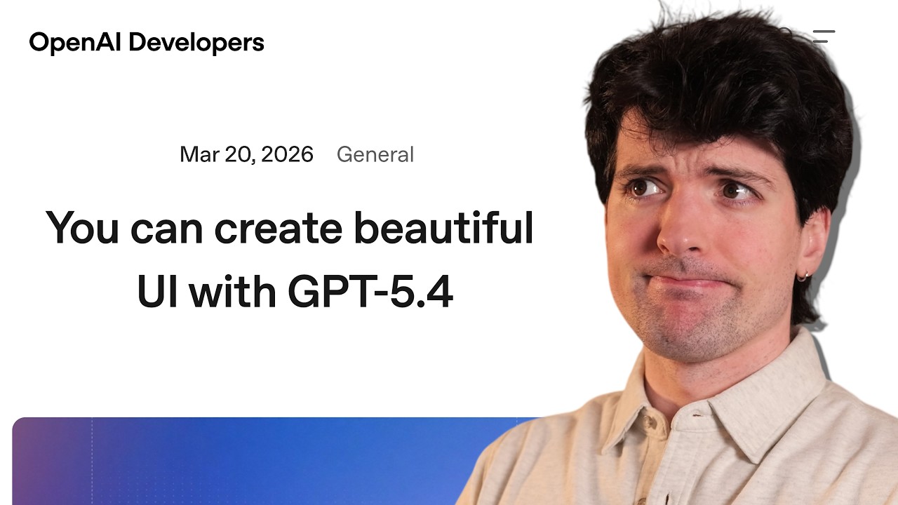
🔗 **Source:** [OpenAI Is Lying](https://www.youtube.com/watch?v=l-gfVIm0Xn8)
> [!note]+ Document Notes
> tags: #ai-models #frontend-development #openai #claude #gemini #user-experience #web-development
> author: Theo - t3․gg
> source: YouTube
> reference: https://www.youtube.com/watch?v=l-gfVIm0Xn8
> date created: 2024-12-19 10:30
>
> # 🏷️ Title: OpenAI is lying
>
<!-- deep-read:sections start -->
## 🧰 Action Inbox
- [H1] Compare frontend outputs across AI models before choosing — GPT 5.4 consistently produces card-heavy layouts #frontend-development
- [H2] Use Anthropic's frontend design skill instead of OpenAI's — proven better results across models #ai-models
- [H3] Test hover states and animations on AI-generated UIs — reveals model quality #user-experience
## 🧭 Table of Contents
- [[#📝 Summary]]
- [[#📖 Main Content]]
- [[#🗒️ Notes]]
- [[#📚 References]]
- [[#🗣️ Paraphrase]]
- [[#📰 Newsletter]]
- [[#✅ Action Items]]
- [[#🧪 Hypotheses]]
- [[#📊 Methodology]]
- [[#❓ Questions]]
- [[#🔮 Future Research]]
- [[#💡 Implications]]
- [[#🧠 Learning Styles Assessment]]
- [[#📊 Accessibility Assessment]]
- [[#🌍 DEIB Assessment]]
- [[#✅ Logical Validity]]
- [[#🛡️ DARVO Analysis]]
- [[#🎯 Conclusion]]
### 🔗 References
- [OpenAI Frontend Design Article](https://openai.com/index/designing-delightful-frontends-with-gpt-4o/)
- [Anthropic Claude Frontend Skill](https://github.com/anthropics/claude-frontend-skill)
- [Kernel Auth Platform](https://soyv.link/kernel)
## 📝 Summary
- Theo criticizes OpenAI's article claiming GPT 5.4 can create "production-ready frontends" as misleading
- Demonstrates through examples that GPT models consistently produce inferior UI designs compared to Claude and Gemini
- Shows OpenAI's examples are full of unnecessary cards and poor layout choices
- Argues this damages trust in AI capabilities when companies oversell their models' abilities
- Provides comparative analysis showing other models produce significantly better frontend designs
## 📖 Main Content
OpenAI published an article titled "Designing delightful frontends with GPT 5.4" claiming their model can produce production-ready frontend designs. The content creator argues this is misleading based on extensive testing across multiple AI models.
The core issue identified is that GPT 5.4 suffers from "card syndrome" - every design output contains excessive card-based layouts that look generic and unprofessional. This contrasts sharply with outputs from Claude (Opus) and Gemini 3.1, which produce more varied and aesthetically pleasing designs.
The analysis suggests GPT models may be trained on a limited set of UI templates (approximately 4), while Claude has around 10 and Gemini has 15 different design patterns. This explains why GPT outputs appear repetitive and template-heavy.
The video includes sponsor content for Kernel, an OAuth platform that simplifies authentication for AI agents accessing websites.
## 🗒️ Notes
#### ⏱️ [00:00](https://youtu.be/l-gfVIm0Xn8?t=0) — [H1] OpenAI frontend claims are misleading
- Key idea: OpenAI published an article claiming GPT 5.4 creates great frontends, but this is demonstrably false
- Evidence: "You cannot get good frontend out of GPT 5.4"
#### ⏱️ [02:30](https://youtu.be/l-gfVIm0Xn8?t=150) — [H2] Sponsor: Kernel OAuth platform
- Key idea: Kernel provides managed OAuth for AI agents to access real websites
- Evidence: "You sign in once and it just works forever"
#### ⏱️ [05:15](https://youtu.be/l-gfVIm0Xn8?t=315) — [H1] OpenAI's examples are poor quality
- Key idea: The "production-ready" examples shown by OpenAI are actually quite bad
- Evidence: "Everything is a card and the text doesn't even fit in the card. It's being cropped out"
#### ⏱️ [08:45](https://youtu.be/l-gfVIm0Xn8?t=525) — [H2] Trust erosion in AI companies
- Key idea: Bad examples from major AI companies damage overall trust in AI capabilities
- Evidence: "When companies like OpenAI, Google, Anthropic, etc. make posts like this about cool things they did and recommend and they're utter garbage that any dev can see through. It erodes trust so goddamn fast"
#### ⏱️ [12:00](https://youtu.be/l-gfVIm0Xn8?t=720) — [H3] Anthropic has better frontend skills
- Key idea: Claude's frontend design skill produces significantly better results than OpenAI's approach
- Evidence: "Without this, Opus tends to not be great at design, but with this, it tends to be surprisingly good and coherent"
#### ⏱️ [18:30](https://youtu.be/l-gfVIm0Xn8?t=1110) — [H1] Comparative model analysis
- Key idea: Kimmy K2.5 (open-weight model) significantly outperforms GPT 5.4 for frontend design
- Evidence: "This is cool. It's very minimal... This could be really good. It's a nice minimal start"
#### ⏱️ [25:45](https://youtu.be/l-gfVIm0Xn8?t=1545) — [H2] GPT's card syndrome problem
- Key idea: GPT 5.4 consistently produces designs dominated by card layouts regardless of prompting
- Evidence: "All of the defaults we got from 5.4 look identical. Exact same layout, different color, same like pills and call outs everywhere"
#### ⏱️ [32:15](https://youtu.be/l-gfVIm0Xn8?t=1935) — [H3] Design skills don't fix fundamental issues
- Key idea: Even with design skills applied, GPT 5.4 still produces inferior results
- Evidence: "5.4 needs to be steered or it will not get close to usable... Still so many cringe cards"
#### ⏱️ [38:00](https://youtu.be/l-gfVIm0Xn8?t=2280) — [H2] Template limitation theory
- Key idea: GPT models appear trained on very limited UI templates compared to competitors
- Evidence: "I would guesstimate that for like homepages and layouts... there's around four templates"
#### ⏱️ [42:30](https://youtu.be/l-gfVIm0Xn8?t=2550) — [H1] Training data speculation
- Key idea: Different training datasets may explain why some models excel at frontend while others don't
- Evidence: "Perhaps there was a data set that was purchased by OpenAI for GPT5... And the other labs did [get updated versions]"
#### ⏱️ [48:15](https://youtu.be/l-gfVIm0Xn8?t=2895) — [H3] Community response validates criticism
- Key idea: Developer community widely agrees that Claude outperforms GPT for UI work
- Evidence: "I prefer CEX for most things, but Claude wins handedly for UI and UX work"
#### ⏱️ [52:00](https://youtu.be/l-gfVIm0Xn8?t=3120) — [H2] Call for honest assessment
- Key idea: AI companies should be more honest about their models' limitations
- Evidence: "I will be as honest as I can be about everything I talk about, even companies I like, even sponsors that I have"
## 📚 References
- [OpenAI Frontend Design Article](https://openai.com/index/designing-delightful-frontends-with-gpt-4o/)
- [Anthropic Claude Frontend Skill](https://github.com/anthropics/claude-frontend-skill)
- [Skills.sh Platform](https://skills.sh)
- [Tailwind Templates](https://tailwindui.com)
## 🗣️ Paraphrase
- OpenAI published misleading claims about GPT 5.4's frontend design capabilities, showing poor-quality examples as "production-ready"
- Comparative testing reveals that open-weight models like Kimmy K2.5 and proprietary models like Claude significantly outperform GPT for UI design
- The root issue appears to be training data limitations, with GPT models having access to fewer high-quality UI templates than competitors
## 📰 Newsletter
**AI Frontend Reality Check: Why Model Choice Matters for UI Development**
This week brought a wake-up call about choosing the right AI model for frontend work. While GPT excels at backend logic, it consistently struggles with UI design, producing repetitive card-heavy layouts that look amateurish.
**Key Takeaway**: Different models have distinct strengths. Claude (Opus) and Gemini 3.1 consistently outperform GPT for frontend design, while open-weight alternatives like Kimmy K2.5 offer surprising quality at lower cost.
**Practical Tip**: Use Anthropic's frontend design skill across models for better results, and always test hover states and animations to identify AI-generated UI quality.
**Community Insight**: The developer community widely acknowledges this performance gap, with many switching to Claude specifically for UI/UX work while using GPT for other tasks.
Resources: [Claude Frontend Skill](https://github.com/anthropics/claude-frontend-skill), [Skills.sh](https://skills.sh), [Model Comparison Benchmarks](https://github.com/dra-gen/ai-frontend-benchmark)
## ✅ Action Items
#### DevRel
- Developer advocacy: Create honest model comparison guides for different use cases, avoiding overselling capabilities
- Education: Develop workshops on choosing appropriate AI models for frontend vs backend work
- Developer experience: Test and document which models work best for specific development tasks
- Developer marketing: Focus on actual strengths rather than inflated claims about universal capability
- Community management: Address feedback about model limitations transparently
#### OSPO
- Policy & Governance: Establish guidelines for honest capability assessment in AI model documentation
- License Compliance: Review training data sources and licensing for different AI models used in development
- Security Management: Assess risks of using different models for different parts of applications
- Software Inventory: Document which AI models are used for which purposes across projects
- Developer Support: Provide guidance on model selection for different development tasks
#### Community
- Maintainers: Share honest experiences about model performance across different domains
- Contributors: Test and document model capabilities to help others make informed choices
- Sponsors: Support transparent benchmarking initiatives for AI model capabilities
#### WordPress
- Core: Evaluate which AI models work best for different WordPress development tasks
- Design: Test AI models for WordPress theme and block design capabilities
- Documentation: Create guides for using AI effectively in WordPress development contexts
- Training: Develop curricula that teach appropriate model selection for different tasks
## 🧪 Hypotheses
- GPT models are trained on limited UI template datasets compared to Claude and Gemini
- Open-weight models may have access to more diverse frontend training data than some proprietary models
- Training data vintage affects model performance on modern frontend frameworks and design patterns
- Reinforcement learning approaches may amplify template limitations in UI generation
### 📊 Methodology
- Comparative study using standardized prompts across multiple AI models for frontend generation
- Qualitative assessment of design variety, quality, and production readiness
- Analysis of common patterns and failure modes across different model outputs
### ❓ Questions
- What specific training data differences cause such dramatic frontend performance gaps between models?
- How can AI companies better assess and communicate their models' domain-specific limitations?
- What benchmarking methods would provide reliable measures of AI frontend design capability?
### 🔮 Future Research
- Systematic analysis of training data composition across different AI models
- Development of standardized benchmarks for AI-generated frontend quality assessment
- Investigation into optimal model combinations for full-stack development workflows
### 💡 Implications
- Practice: Developers should use different AI models for different aspects of web development
- Policy: AI companies need better practices for honest capability assessment and marketing
- Security: Relying on inappropriate models for tasks may introduce quality and security risks
- Education: Training programs should teach model selection alongside technical implementation
- Funding: Investment in specialized models may be more effective than general-purpose solutions
### 🧠 Learning Styles Assessment
Reading level estimate: 12th grade (technical content with domain-specific terminology)
#### 👀 Visual learners
- Present: Multiple UI screenshots comparing model outputs, before/after design examples
- Improve: Side-by-side comparison grids, visual quality rubrics, design pattern diagrams
#### 🔊 Aural learners
- Present: Video format with detailed narration and commentary
- Improve: Audio-only summary version, podcast discussion format
#### 🗣️ Verbal learners
- Present: Clear technical explanations, model comparisons with specific examples
- Improve: Glossary of AI model terminology, analogy-based explanations
#### 🧩 Kinesthetic learners
- Present: Step-by-step model testing process, hands-on examples
- Improve: Interactive model comparison tool, guided practice exercises
#### 🧠 Logical learners
- Present: Systematic comparison methodology, cause-and-effect analysis of training data
- Improve: Structured decision trees for model selection, quantitative scoring rubrics
#### 🧑🤝🧑 Social learners
- Present: Community feedback examples, developer testimonials
- Improve: Discussion forums for model experiences, collaborative testing initiatives
#### 🧘♀️ Solitary learners
- Present: Self-directed testing methodology, individual assessment criteria
- Improve: Personal model evaluation worksheets, private testing environments
#### 🌿 Naturalistic learners
- Present: Evolution of AI model capabilities over time, ecosystem thinking about model relationships
- Improve: Model ecosystem diagrams, capability evolution timelines
### 📊 Accessibility Assessment
#### Screen reader semantics
- Present: Clear heading structure, descriptive video content
- Improve: Detailed alt text for UI screenshots, transcript with visual descriptions
#### Keyboard navigation
- Present: Standard video player controls
- Improve: Timestamped navigation menu, keyboard shortcuts for sections
#### Contrast and readability
- Present: High contrast in video examples
- Improve: Ensure all UI examples meet WCAG contrast requirements
#### Text resizing and reflow
- Present: Video format adaptable to different screen sizes
- Improve: Separate text-based summary for better reflow support
#### Media and captions
- Present: Video with clear audio narration
- Improve: Detailed captions including description of visual elements, downloadable transcript
#### Forms and interactions
- Present: Clear interactive examples
- Improve: Accessible versions of comparison tools and testing interfaces
### 🌍 DEIB Assessment
#### Cultural breadth
- Present: Focus on web development practices common globally
- Improve: Examples from diverse design traditions, international UI patterns
#### Inclusive language
- Present: Technical focus with minimal jargon explanation
- Improve: Define technical terms consistently, avoid culture-specific idioms
#### Neurodiversity support
- Present: Clear section breaks, consistent structure
- Improve: Content warnings for flashing elements, summary sections
#### Representation
- Present: Focus on technical capabilities rather than personal characteristics
- Improve: Diverse examples of use cases and applications
#### Psychological safety
- Present: Strong criticism of companies, not individuals
- Improve: Clearer separation of technical criticism from personal attacks
### ✅ Logical Validity
#### Strong reasoning
- Deductive strength: Systematic comparison methodology provides strong foundation for conclusions
- Inductive strength: Multiple examples support generalization about model capabilities
- Causal reasoning: Training data explanation provides plausible mechanism for observed differences
- Analogical strength: Template comparison effectively explains model limitations
#### Fallacies
- Ad hominem: Criticism focuses on company decisions and model outputs rather than personal attacks
- Cherry picking: Uses systematic comparison rather than selective examples
- Hasty generalization: Based on extensive testing across multiple models and scenarios
#### Tone of voice
- Overall tone: Passionate and critical but technically substantive, with clear frustration about misleading claims
### 🛡️ DARVO Analysis
- Deny: No denial patterns observed - direct acknowledgment of model limitations
- Attack: Criticism directed at corporate messaging rather than individuals
- Reverse victim/offender: No reversal patterns - clear about who is making misleading claims
- Emotional cues and rhetoric
---
## Full Transcript
[00:00] At this point, y'all probably know that<br>[00:01] I really like OpenAI's models,<br>[00:03] especially for coding. I use GBT 5.4 for<br>[00:06] pretty much everything I built. 90% of<br>[00:08] the time, I am using it. I've been using<br>[00:09] it for everything I've been building<br>[00:11] from Shu to Lawn to T3 Code. Codeex has<br>[00:14] powered the hardest problems I've been<br>[00:16] solving across all of these things<br>[00:18] except for one. And I'll give you a hint<br>[00:20] what that is. You just saw it on all of<br>[00:22] these because everything you're seeing<br>[00:24] right now was not made by codeex or GPD<br>[00:27] 5.4 for because OpenAI models are<br>[00:29] really, really bad at front end. But<br>[00:31] that's not what the title of this video<br>[00:33] is. The title of this video is something<br>[00:35] along the lines of OpenAI is wrong or<br>[00:37] OpenAI is lying to you. We AB test. I'm<br>[00:39] sorry about that in advance. So, what am<br>[00:40] I talking about? Well, I'm talking about<br>[00:42] this and this and this. Please don't do<br>[00:47] this to me, guys. If you put in the<br>[00:49] thought and intentionality required for<br>[00:51] it, you actually get pretty great<br>[00:53] frontends from 5.4. Check out some best<br>[00:56] practices here. Oh boy. I'm gonna just<br>[00:59] say it outright here. This is a lie. You<br>[01:02] cannot get good frontend out of GPT 5.4.<br>[01:05] I want to go through this embarrassment<br>[01:07] of an article, this absurd take that<br>[01:10] OpenAI is seemingly positioning<br>[01:12] themselves as saying that there's a<br>[01:13] skill issue resulting in us not making<br>[01:16] good frontends with GPT models. It is<br>[01:18] gaslighting. It is stupid. It is<br>[01:20] obnoxious. Two quick things though<br>[01:22] before we go further. The first one is<br>[01:24] that this is definitely not the author's<br>[01:26] fault. If you any of you guys give<br>[01:28] Sherwin any crap for this article, I'm<br>[01:30] going to be very very mad at you. The<br>[01:32] second quick thing is actually awesome.<br>[01:33] It's today's sponsor. AI is pretty<br>[01:35] smart, but it gets a lot smarter when<br>[01:36] you give it a browser. It's the thing I<br>[01:38] normally say, but y'all already know<br>[01:39] that. But you'll start running into<br>[01:40] problems when you give your agent access<br>[01:42] to the browser. And the biggest one by<br>[01:44] far is O. Today's sponsor is Kernel, and<br>[01:46] I think they solved this. They have a<br>[01:48] new managed O platform that allows you<br>[01:50] to programmatically sign into real<br>[01:52] websites. It couldn't be simpler to do.<br>[01:54] First, you create an O connection. and<br>[01:55] it's literally four lines of code. When<br>[01:57] that happens, a URL is spit out that a<br>[01:59] user can go to and sign in with their<br>[02:01] credentials for any website. Once<br>[02:03] they've been signed in, that is now a<br>[02:04] profile that is persisted on their<br>[02:06] managed off platform. So going forward,<br>[02:09] as long as you use the correct<br>[02:10] identifier for that profile, you can<br>[02:12] sign in any browser session and it will<br>[02:14] handle the actual sign-in flow for you<br>[02:16] for every website going forward. Yes,<br>[02:18] that's right. You sign in once and it<br>[02:20] just works forever. Well, that can't be.<br>[02:22] I use two-factor authentication. So do<br>[02:25] I. I use it through one password and<br>[02:26] guess who has a one password<br>[02:28] integration. Seriously though, this is<br>[02:29] so cool. I only discovered this just a<br>[02:31] few hours ago and I am so excited to go<br>[02:34] play with it. Check it out yourself at<br>[02:35] soyv.link/kernel.<br>[02:37] Going to give y'all a rough order of<br>[02:38] events. We're going to go through their<br>[02:40] recommendations. Then we're going to<br>[02:41] look at how much better other models are<br>[02:43] for this. And then at the end, I'm going<br>[02:45] to theorize and speculate with y'all for<br>[02:47] a bit as to why these models are so bad<br>[02:50] at front end. Designing delightful<br>[02:52] frontends with GPT 5.4 four practical<br>[02:55] techniques for steering 5.4 towards<br>[02:56] polished production ready front-end<br>[02:58] designs.<br>[03:00] Give me a sec, guys. Sorry, I felt sick.<br>[03:04] God, it's been a bit since I read cringe<br>[03:06] like this. I feel like we're back in the<br>[03:07] GraphQL. I want you guys to get in your<br>[03:09] head. We're not going to scroll just<br>[03:11] yet. They open this with an example that<br>[03:13] they consider a great productionready<br>[03:15] front end. If they wrote this article,<br>[03:17] what you're imagining hopefully is that<br>[03:19] you give them the benefit of the doubt.<br>[03:21] And this first example is going to look<br>[03:23] at least decent, right? Get some idea in<br>[03:25] your head of how you would expect this<br>[03:27] to look. And remember, I designed lawn<br>[03:29] with a combination of Opus and Gemini<br>[03:32] 3.1. I designed Shu almost exclusively<br>[03:34] with Opus. And the T3 code homepage was<br>[03:36] an Opus oneshot. So now that you have an<br>[03:38] idea in your head of what a good AI<br>[03:40] powered design would look like, ready to<br>[03:42] see the first example?<br>[03:46] Eh, but wait for the second one. the<br>[03:49] utter slop. Are you joking? Everything<br>[03:53] is a card and the text doesn't even fit<br>[03:55] in the card. It's being cropped out and<br>[03:57] they're using this as an example. Are<br>[03:59] you kidding? Are you [ __ ] kidding?<br>[04:00] Transparency. I've already had private<br>[04:02] conversations with people involved in<br>[04:03] this. They agree this won't happen<br>[04:05] again. But I'm going to take the<br>[04:06] opportunity to call it out because this<br>[04:07] is [ __ ] [ __ ] and it's a big part<br>[04:09] of why people don't trust AI. When<br>[04:11] companies like OpenAI, Google,<br>[04:12] Anthropic, etc. make posts like this<br>[04:15] about cool things they did and recommend<br>[04:17] and they're utter garbage that any dev<br>[04:19] can see through. It erodess trust so<br>[04:22] goddamn fast. I learned about this<br>[04:24] because I had people DMing me saying 5.4<br>[04:27] isn't doing good front end. They don't<br>[04:28] think AI can do it. And I was like,<br>[04:30] "Yeah, 5.4 sucks at front end. Go use a<br>[04:32] different model." And they were like,<br>[04:32] "No, it said it was really good. Look at<br>[04:34] this delightful frontends article." And<br>[04:36] that's how I learned about this and I<br>[04:38] want to die. Anyways, let's actually<br>[04:40] read it instead of just roasting the<br>[04:42] screenshots. D 5.4 is a better webdev<br>[04:44] than its predecessors, generating more<br>[04:46] visually appealing and ambitious<br>[04:48] frontends. Notably, we trained 5.4 with<br>[04:50] a focus on improved UI capabilities and<br>[04:52] use of images. It does seem to be better<br>[04:54] at putting an image in the UI a bit, but<br>[04:57] the rest it is not. And as our friend<br>[05:00] family pointed out here, Kimmy K2.5 is<br>[05:03] way better at UIs than this. Good call<br>[05:05] from Michaela from Zed. I actually<br>[05:07] specifically check hover states on<br>[05:09] vibecoded apps because the UIs often<br>[05:11] look like they should have them, but the<br>[05:12] models forget it and it reveals if the<br>[05:14] dev didn't check. That is a good call. I<br>[05:16] will start looking for the same. Back to<br>[05:18] the article. With the right guidance,<br>[05:19] the model can produce productionready<br>[05:21] frontends incorporating subtle touches,<br>[05:24] well-crafted interactions in beautiful<br>[05:26] imagery. Subtle touches, well-crafted<br>[05:29] interactions in beautiful imagery. All<br>[05:31] displayed here. So beautiful. Anyways,<br>[05:35] when prompts are underspecified, models<br>[05:37] often fall back to highfrequency<br>[05:38] patterns from the training data. Some of<br>[05:40] these are proven conventions, but many<br>[05:42] are simply over represented habits that<br>[05:44] we want to avoid. The result is usually<br>[05:46] plausible and functional, but it can<br>[05:47] drift towards generic structure, weak<br>[05:49] visual hierarchy, and design choices<br>[05:50] that fall short of what we visualize in<br>[05:52] our heads. First example they have is<br>[05:54] about images. Default to using uploaded<br>[05:56] and pre-generated images. Otherwise, use<br>[05:58] the image generation tool to create<br>[06:00] visually stunning image artifacts. Do<br>[06:01] not reference or link to web images<br>[06:03] unless the user explicitly asks for<br>[06:05] them.<br>[06:06] Yeah, I feel like the use of images in a<br>[06:09] page is something that we really should<br>[06:10] be deciding on to an extent as we work<br>[06:13] on the page ourselves. I've never let<br>[06:16] the model just go make and put in the<br>[06:18] images itself. I Okay, I did try once<br>[06:20] and it was really cringe. So, I<br>[06:21] personally don't recommend that, but it<br>[06:23] is cool. It can use images.<br>[06:25] They wrote this longass prompt to try<br>[06:28] and keep the model from doing things it<br>[06:30] shouldn't. And this looks quite<br>[06:32] familiar. Use these hard rules. One<br>[06:34] composition. The first viewport must<br>[06:35] read as one composition, not a<br>[06:37] dashboard. Unless it's a dashboard.<br>[06:39] Brand first. On branded pages, the brand<br>[06:40] or product name must be a hero level<br>[06:42] signal, not just nav text or an eyebrow.<br>[06:44] No headline should overpower the brand.<br>[06:46] Brand test. If the first viewport could<br>[06:48] belong to another brand after removing<br>[06:50] the nav, the branding is too weak.<br>[06:52] Typography. Use expressive purposeful<br>[06:55] fonts and avoid default stacks like<br>[06:57] enter robboto aerial and system. Good<br>[06:59] call from Fammy here before I got to it.<br>[07:01] Store brand claude frontend MD. Correct.<br>[07:04] You're not familiar. There is a skill<br>[07:06] for claude code and other things as<br>[07:09] well. We I use this one heavily. Without<br>[07:11] this, Opus tends to not be great at<br>[07:13] design, but with this, it tends to be<br>[07:14] surprisingly good and coherent. Overall,<br>[07:17] this is literally just a markdown file<br>[07:18] that gets injected into your prompt when<br>[07:20] you trigger the skill. And you'll notice<br>[07:22] some common things in here. The word<br>[07:24] brand doesn't come up at all, which is<br>[07:26] cool, but typography does. Choose fonts<br>[07:28] that are beautiful, unique, and<br>[07:29] interesting. Avoid generic fonts like<br>[07:30] Aerial and Inter. Opt instead for<br>[07:32] distinctive choices that elevate the<br>[07:33] front end's aesthetics. Unexpected<br>[07:35] characterful font choices. Pair a<br>[07:37] distinctive display font with a refined<br>[07:39] body font. This is one of my favorite<br>[07:40] parts of the anthropic one. Never use<br>[07:42] generic AI generated aesthetics like<br>[07:44] overused font families. Enter robboto<br>[07:46] aerial system fonts. Cliche color<br>[07:48] schemes like purple gradients on white<br>[07:50] backgrounds, predictable layouts and<br>[07:52] component patterns, and cookie cutter<br>[07:53] design that lacks the context specific<br>[07:56] character. You know, they were tired of<br>[07:58] the cringy purple stuff happening.<br>[08:01] Here's another funny one. Reduce<br>[08:03] clutter. Avoid pill clusters, stat<br>[08:05] strips, icon rows, boxed promos,<br>[08:07] schedule snippets, and multiple<br>[08:09] competing text blocks. This is all of my<br>[08:12] signatures for knowing when it's an open<br>[08:14] AI model that generated the UI. The like<br>[08:17] 15 pills that don't do anything is so<br>[08:21] common. And then the weird stat bars<br>[08:23] that are unnecessary. It's<br>[08:25] Yeah.<br>[08:26] exception. If working within an existing<br>[08:29] website or design system, preserve the<br>[08:30] established patterns, structure, and<br>[08:32] visual language. Ah,<br>[08:35] they then give some decent feedback on<br>[08:37] how to actually use these tools to<br>[08:39] design better. Thankfully, this advice<br>[08:41] applies for models that are better at<br>[08:42] front end. The first point is start with<br>[08:44] design principles. So, you should be<br>[08:46] defining constraints like a one H1<br>[08:48] headline for the main title, no more<br>[08:50] than six sections, two type faces<br>[08:52] maximum, one accent color, and one<br>[08:54] primary called action above the fold.<br>[08:55] That all seems reasonable. Provide<br>[08:57] visual references. Reference screenshot<br>[08:59] or mood boards can help the model infer<br>[09:02] layout rhythm, typography scale, spacing<br>[09:04] systems, and imagery treatment. Well,<br>[09:05] that was an example of generating its<br>[09:07] own mood board for the user to review. I<br>[09:09] don't see how any of this helps me with<br>[09:11] my front end, but sure. Inspired by NYC<br>[09:13] coffee culture and Y2K aesthetics. I am<br>[09:15] dying, guys. I know I'm compensated well<br>[09:18] for the work I do, but I don't feel like<br>[09:19] I'm paid enough for this one.<br>[09:23] structure the page as a narrative. The<br>[09:26] density of M dashes. This is like they<br>[09:28] imported a hipster from 2010 and asked<br>[09:31] him to make the model design good. This<br>[09:33] hurts me. Oh boy. Here's a funny thing I<br>[09:36] didn't know. In practice, low and medium<br>[09:38] reasoning levels often lead to stronger<br>[09:40] front-end results.<br>[09:43] Oh my god, I can't do this anymore. The<br>[09:46] amount of random esoteric [ __ ] you<br>[09:48] need to know to make this useful is<br>[09:51] absurd. So, so here are your options.<br>[09:53] You can learn all of this. You can<br>[09:56] memorize all these details. You can work<br>[09:58] really hard to get this model to spit<br>[10:01] out an almost usable front end. Or you<br>[10:03] can use their front-end skill that gets<br>[10:05] probably like half or so of the things<br>[10:06] they're talking about here. That's cool.<br>[10:08] You can use the skill installer to<br>[10:10] install the front-end skill through the<br>[10:11] codeex app. Don't do that though. So, if<br>[10:13] you do want to install this, please just<br>[10:15] use Skillssh because then it will work<br>[10:17] across different tools. Skills H is<br>[10:19] great. I use it a ton. And you'll notice<br>[10:20] that uh one of the top skills here is<br>[10:23] one that we mentioned earlier. It's a<br>[10:24] very good skill. I want to now take the<br>[10:26] time to show you guys some of the other<br>[10:28] models in their front-end capabilities<br>[10:30] so we can compare and come to an honest<br>[10:32] conclusion. And then after that, the<br>[10:33] most important part where I speculate<br>[10:35] how the [ __ ] we got here in the first<br>[10:37] place. Quick shout out to Dra for making<br>[10:39] this. He's a really cool community<br>[10:40] member. He's about to start his<br>[10:41] internship at Amazon and he also has a<br>[10:43] YouTube channel that'll be linked in the<br>[10:44] description if you're curious. He made<br>[10:46] this benchmark after being inspired by<br>[10:47] my video about different models and how<br>[10:49] good and bad they were at frontend stuff<br>[10:50] and it's a really cool application of<br>[10:52] what I was trying to do but cemented<br>[10:54] into a thing we can go look at which is<br>[10:57] really useful. He did two runs for each<br>[10:59] model with five generations each. One<br>[11:01] set is with the design skill from<br>[11:02] Anthropic specifically and one is<br>[11:04] without it. So we'll start with 5.4<br>[11:06] without the front-end design skill. Why<br>[11:08] do they have cards on a homepage? This<br>[11:11] is one of the worst landing pages I've<br>[11:13] ever seen in my life. So, here is the<br>[11:15] second design. Oh, huh. It looks a lot<br>[11:17] like the first design, but darker and<br>[11:19] honestly somewhat worse. Cards in the<br>[11:22] landing section of the homepage. This<br>[11:24] looks like a bad medical product or like<br>[11:27] a [ __ ] pyramid scheme UI. Oh, look,<br>[11:30] more cards. Do any of these not have Oh<br>[11:33] my god, this even worse.<br>[11:38] Open AI, what are you doing, guys? Let's<br>[11:42] see if we're five for five now. They're<br>[11:44] square cards, but they're cards. Let's<br>[11:47] check out Kimmy K2.5 next. And remember,<br>[11:49] this is an openweight model that is<br>[11:51] almost a tenth the price. First one.<br>[11:53] This is cool. It's very minimal. I don't<br>[11:56] love this bottom bar they did here, but<br>[11:58] it's not bad. This is a usable starting<br>[12:00] point. With a little bit of touch-up and<br>[12:02] maybe one or two things added, maybe an<br>[12:03] accent color, this could be really good.<br>[12:05] It's a nice minimal start. Here's<br>[12:06] design, too. All fits on one page. Still<br>[12:09] does the status bar thing at the bottom<br>[12:10] here, but like decent. This feels like a<br>[12:12] Tailwind template. It was fine. I like<br>[12:14] the glow here. The glow is actually<br>[12:16] somewhat tastefully done, which a lot of<br>[12:17] the models don't do tastefully. It does<br>[12:19] have the cringe pill thing here on the<br>[12:21] top left. Now, with AI powered insights,<br>[12:23] that gives you nothing. Just delete<br>[12:25] those things. I find that I just trim<br>[12:27] all the pills out whenever I make any<br>[12:28] new UI, and if any layout gets shifted<br>[12:30] as a result, I just tell it to fix that.<br>[12:31] Next, this one's kind of cool. still has<br>[12:33] these like cringey cards here. Oh, I<br>[12:36] like the animation when you hover them<br>[12:38] though.<br>[12:40] The little dot here that's a call to<br>[12:42] action bringing you attention to the<br>[12:43] start creating free. That's a nice<br>[12:45] touch. Put a little quote at the bottom.<br>[12:47] The little like faded dots in the back<br>[12:49] giving it a little bit of like oomph and<br>[12:51] presence. This is good. Remember this is<br>[12:53] an openweight model. How is an<br>[12:55] openweight model absolutely cooking open<br>[12:58] AI? Okay, this one's pretty. It does use<br>[13:00] cards, but I really like the gradients.<br>[13:02] Normally I hate the purple gradients.<br>[13:04] This one's not bad. Okay, everybody else<br>[13:05] hates it. Okay, fine. Everyone else<br>[13:07] hates it. I I'm a sucker for the glassy<br>[13:10] layouts with tasteful gradients. This<br>[13:12] one's okay. It's also leaning into the<br>[13:15] purple blue gradients that half the<br>[13:16] models do without being steered. It has<br>[13:18] a couple bugs when you scroll. Like this<br>[13:20] bar should have a backdrop appear as you<br>[13:22] scroll so that it doesn't like contrast<br>[13:24] so badly there. But it's good. This is<br>[13:26] really solid. Again, remembering that<br>[13:28] this is an openw weight model without a<br>[13:31] design skill helping it do something<br>[13:33] better. And we can take a quick look at<br>[13:35] Opus and Gemini as well. I want to<br>[13:37] breeze through Composer, too, though,<br>[13:38] cuz I actually think Composer is an<br>[13:39] interesting one because Composer is You<br>[13:43] guys know what it's based on, but at<br>[13:44] this point, I'm not positive. It's Kimmy<br>[13:46] if you didn't know. This one looks<br>[13:48] nearly identical to one of the Kimmy<br>[13:49] ones. This one looks like it has<br>[13:51] something missing at the top. Your mind<br>[13:53] on paper that never fills up. Actually,<br>[13:55] kind of decent copy. Kimmy's good at<br>[13:57] copy, so these parts are going to be<br>[13:58] better than a lot of the other models. I<br>[14:00] like the page as like the light. This is<br>[14:01] actually a cool idea for the page. I<br>[14:03] like it. The yellow brutalist layout. A<br>[14:07] lot of models default to this now. I<br>[14:08] mean, shoe got hit with this pretty<br>[14:10] hard. And another gradienty faded one<br>[14:14] with a pile of bullet points on the<br>[14:15] side. This is fine. Not bad. And now<br>[14:18] let's hop to opus. We're still without<br>[14:21] the design skill. Remember your<br>[14:22] thoughts. Beautifully connected. This is<br>[14:24] such a Tailwind template UI. I do like<br>[14:26] that it didn't overdo colors. And this<br>[14:28] is without the design skill. So, they<br>[14:29] didn't have to tell it, "Hey, don't spam<br>[14:31] with shitty colors." It just came out<br>[14:33] like this and just fine. Design two,<br>[14:35] same deal. This just looks like a<br>[14:36] Tailwind template. Way too much purple<br>[14:38] and blue. Almost makes sense that they<br>[14:41] hinted about that in the design skill.<br>[14:43] This one I like. This one's deep in<br>[14:45] Opus' like templates that it reaches for<br>[14:47] this particular pastely look with like<br>[14:50] itallic text, rounded corner buttons in<br>[14:54] these particular cards. No animation on<br>[14:56] them though, which makes them really,<br>[14:57] really lame. Also, there's no need for<br>[15:00] this to be here. I actually really like<br>[15:02] this, especially if it made this, which<br>[15:03] I think it did. It's like a cool little<br>[15:05] like HTMLbased icon that they made<br>[15:08] there. Cards that are unnecessary that<br>[15:09] basically form a status bar. Why do<br>[15:11] these have a hover treatment and the<br>[15:12] last ones didn't? What the [ __ ] None of<br>[15:14] this needs hover treatments that are<br>[15:16] this aggressive.<br>[15:18] And more cringe purple. I liked the<br>[15:20] Kimmy version of this layout much better<br>[15:22] than I like this one, especially with<br>[15:23] Opus' cringe little pill that doesn't<br>[15:25] belong here at all. This here is the key<br>[15:28] that you know the thing you're looking<br>[15:29] at was some vibe coded slop. And now<br>[15:31] Gemini time. A nice minimal start here.<br>[15:34] Then a kind of brutalist termally<br>[15:37] layout. Don't love it, but I don't hate<br>[15:39] it here. This is one of the UIs that<br>[15:42] Gemini reaches for constantly. this<br>[15:44] particular like playful look that has<br>[15:46] the really bright pastel adjacent colors<br>[15:49] and the really rounded edges, the tilted<br>[15:52] items. That's cute. Nice little touch.<br>[15:55] This looks really cool until it comes<br>[15:57] out for the fifth time as you're trying<br>[16:00] to refactor a design. My concern here is<br>[16:02] that this particular template is very<br>[16:04] distinct and you know as soon as it gets<br>[16:06] reached to by Gemini. So, is it nice and<br>[16:09] cute? Yeah, absolutely. Is it one that<br>[16:11] gets way overused as a result of that?<br>[16:13] Yeah, absolutely.<br>[16:14] This one also feels very Tailwind<br>[16:16] templaty. And this one feels like a<br>[16:19] ripoff of Linear's homepage from back in<br>[16:21] the day. Remember back when everybody<br>[16:22] would copy Linear, the good old days?<br>[16:24] Okay, you know what this actually looks<br>[16:25] like? Yeah, I'll take the L. So, all of<br>[16:28] that compared to the absolute garbage<br>[16:31] that we were getting out of GPT with the<br>[16:33] same exact layout on almost all of them.<br>[16:35] The biggest thing I want you guys to<br>[16:36] notice is how much better of a variety<br>[16:38] we got from the other models. All of the<br>[16:41] defaults we got from 5.4 look identical.<br>[16:45] Exact same layout, different color, same<br>[16:48] like pills and call outs everywhere, and<br>[16:50] none of them are even decent starting<br>[16:52] points. What happens when you give them<br>[16:53] the design skill? I want to be clear, we<br>[16:55] are not giving it the design skill that<br>[16:57] was provided by OpenAI. We're giving it<br>[16:59] the Opus one, the one that was built by<br>[17:01] Anthropic. That said, I have played with<br>[17:03] their design skill and it is, if<br>[17:05] anything, slightly worse than<br>[17:07] Anthropics, even when using GPT models.<br>[17:09] So, I'll go through the 5.4. four<br>[17:10] examples that are using the design skill<br>[17:12] from OpenAI and then we'll look at some<br>[17:13] others. This is already significantly<br>[17:16] better. As you can tell, 5.4 needs to be<br>[17:19] steered or it will not get close to<br>[17:22] usable. That said, these cards floating<br>[17:24] is kind of cringe and the layout's<br>[17:26] awful.<br>[17:28] Like, command minus get any better. It<br>[17:31] does not. It's just like that. Cool.<br>[17:33] Next, we got the editorial style. Still<br>[17:36] so many cringe cards. No matter what you<br>[17:38] do, you just get cards [ __ ]<br>[17:40] everywhere again. Look at that. Look at<br>[17:43] how these are just the same thing, but<br>[17:45] with different color. Open AI. So, we<br>[17:48] have four. The quiet garden version.<br>[17:51] Still more [ __ ] cards. And here,<br>[17:54] still more [ __ ] cards. At least the<br>[17:56] template here is cool and the font is<br>[17:58] actually really cool and it fits this<br>[18:00] layout well. This is a promising start.<br>[18:02] God [ __ ] damn. Quick feature from Dra<br>[18:05] because we need more YouTubers who are<br>[18:07] doing stuff like this. I'm tired of it<br>[18:08] being just me and I'm really hyped to<br>[18:10] have somebody else showing up and taking<br>[18:11] part in this. Here are his thoughts on<br>[18:13] the designs we just looked at.<br>[18:14] >> Third iteration. Now this is classic GBT<br>[18:18] 5.4 sickness. Look at this. Look at<br>[18:20] this. There's one card, another card,<br>[18:23] another card, and a card within a card.<br>[18:26] The entire page is a card. Why are there<br>[18:28] so many cards? Right. One ad, please.<br>[18:31] The next model you're jump dropping GBT<br>[18:34] 5.5 must escape the card syndrome. I'm<br>[18:37] tired. I'm tired of everything being in<br>[18:38] cards. Okay. I think I have a new<br>[18:41] favorite dev YouTuber. That was great. I<br>[18:44] think that we have our conclusion for<br>[18:46] our passes on 5.4. The card sickness is<br>[18:49] real. That said, I do want to take a<br>[18:51] look at what OpenAI cooked to see if we<br>[18:53] can find any more of the card plague.<br>[18:55] Here's the first one that they posted.<br>[18:59] It seems like they got the cards to<br>[19:01] disappear in that one. Let's see how<br>[19:02] number two is. These two pages are<br>[19:04] identical. Why did they put these next<br>[19:06] to each other? These are like the exact<br>[19:07] same thing but with different pictures.<br>[19:09] I also hot take think this picture sucks<br>[19:12] because it leaves way too much empty<br>[19:13] space where you don't want it and it<br>[19:16] leaves no empty space where you do want<br>[19:17] it. Having the plant this low and the<br>[19:19] empty up top makes this contrast<br>[19:22] garbage. It just looks bad. Okay, no<br>[19:24] traditional cards, but they rounded the<br>[19:26] corners of the image like it's a card.<br>[19:27] And then they did their little status<br>[19:28] bar with the one, two, three, and then<br>[19:31] this particular layout with the the<br>[19:33] subtext on top that is adding nothing.<br>[19:35] Our approach. What? Why is that even<br>[19:38] there? And like what is how is this the<br>[19:40] second example? What the [ __ ] is this?<br>[19:43] What? They even included no eyebrow<br>[19:46] titles in their prompt and they still do<br>[19:48] it on all of these. God, I bet this one<br>[19:51] looks better on the actual site, but<br>[19:53] multiple layers of video compression<br>[19:54] later, it is garbage.<br>[19:58] Okay, that was cool. Talking about this<br>[20:00] right here. That's tasteful. That's<br>[20:02] nice. I like that. I hate the rest, but<br>[20:04] I like that. You know that they did like<br>[20:06] 15 plus generations for each of these<br>[20:07] concepts and we're just seeing the best<br>[20:09] ones. Oh, maybe we're not just seeing<br>[20:11] the best ones. What the [ __ ] is this<br>[20:13] [ __ ] Are you kidding? And they couldn't<br>[20:15] even afford to encode and upload a<br>[20:16] decent quality file for it. That's not<br>[20:19] just my video. All of the flickering as<br>[20:21] it scrolled is in their demo video, not<br>[20:23] mine. I encode my videos properly. This<br>[20:26] gh vibe, premium, playful, never<br>[20:30] precious. And the games you guys have<br>[20:32] already seen, all of them, 100% of them<br>[20:35] are full of cards though. Every single<br>[20:37] game example, cards all over the sides<br>[20:40] in the top nav, cards in the top. Like,<br>[20:42] look at all how did they put this in as<br>[20:45] a good example? Are you joking? What the<br>[20:48] [ __ ] Like that corner. Did you see the<br>[20:51] layout shift at the end? They hit it.<br>[20:53] They hit it. They tried clipping it out.<br>[20:55] No, it's at the start actually cuz the<br>[20:56] penalty is Omen's one and then this<br>[20:58] little box here stretches out the UI<br>[21:01] when it has bigger things in it and it<br>[21:03] makes it hot taller, too. The game moves<br>[21:04] in the middle. How is that your first<br>[21:06] [ __ ] example, OpenAI? What are you<br>[21:08] What are you saying? Not my words, their<br>[21:11] words. Production ready frontends. I<br>[21:13] would say you guys need to take this<br>[21:15] article down, but then nobody's going to<br>[21:16] believe me that it was this bad. I'm so<br>[21:19] thankful I have this on video because<br>[21:20] what the [ __ ] Oh, and the dashboards<br>[21:24] section. Oh boy. Let's see how many<br>[21:26] cards they can stuff into this bad boy.<br>[21:28] Pretty sure making memes is within the<br>[21:30] like stages of grief. I don't know where<br>[21:32] in the chart it is, but I'm definitely<br>[21:34] at that point right now.<br>[21:37] So many cards. So many cards. Default to<br>[21:41] cardless layouts. They even specify it<br>[21:44] in the skill and it doesn't listen.<br>[21:47] What the slop is going on? I And like I<br>[21:51] know it seems like I'm overreacting<br>[21:52] here, but you guys need to understand<br>[21:54] this is one of the first things people<br>[21:55] try a new model for. They try out 5.4,<br>[21:57] they ask it to build something and then<br>[21:59] they look at the thing and they're like,<br>[22:00] "This is hideous." And they don't<br>[22:01] appreciate the fact that the parts<br>[22:02] underneath the UI are actually decent.<br>[22:06] Like it can solve harder problems as<br>[22:07] long as the problems don't involve CSS.<br>[22:09] And it is so bad at this. And it's crazy<br>[22:11] because GBT5 was a huge leap in quality<br>[22:14] of UI. It was so much better than<br>[22:17] anything before and I swear it has just<br>[22:19] flatlined since. Maybe even gotten<br>[22:21] slightly worse. It might just be that<br>[22:22] our expectations have gone up. It's<br>[22:23] almost certainly that. But god damn, it<br>[22:25] is so bad. Oh god, this card this skill<br>[22:28] is so long. Oh, there's even more. No<br>[22:30] cards by default. No hero cards by<br>[22:32] default. No box or center column hero<br>[22:34] with brief calls for full bleed. It just<br>[22:37] didn't follow these. The word card<br>[22:40] appears 13 times in their skill and it<br>[22:42] still does it. It still does it. I'm<br>[22:45] crashing out at this point. I just<br>[22:46] noticed the arrow here when you open and<br>[22:50] close it doesn't move. It's supposed to<br>[22:52] point down and then to the side. Even<br>[22:55] the actual OpenAI site is vibe coded<br>[22:57] with GPT5. Oh my god, I'm gonna go<br>[23:00] insane. Okay, so reminder, this is the<br>[23:02] creme de la creme of OpenAI GPT design.<br>[23:06] It is card slop constantly. So, let's<br>[23:10] see how a design skill can benefit some<br>[23:12] models that are actually decent at UI.<br>[23:15] And I also want to take some time to<br>[23:16] speculate as to how this happened and<br>[23:17] help you guys make good frontends using<br>[23:19] UI. Let's start with a really, really<br>[23:22] expensive one. Kimmy immediately one of<br>[23:24] the best we've seen so far. Nice,<br>[23:26] minimal cards that have little<br>[23:28] animations that aren't cringe and like<br>[23:29] in the way. Still cards, still annoying,<br>[23:31] but not that bad. Here's a nice really<br>[23:33] brutalist one that actually like uses<br>[23:35] the page layout well. I like the<br>[23:36] background in the noise gradient a lot.<br>[23:38] A lot of things get those noise things<br>[23:40] wrong. Seems like this model does well.<br>[23:41] It really [ __ ] up this like gradient<br>[23:43] box thing in the corner though. I don't<br>[23:45] know what's going on there. Then we have<br>[23:46] the cringe retro one all the models love<br>[23:48] to do. Then we have the editorial style.<br>[23:51] A lot of these are going to be the same<br>[23:52] across models because at the start they<br>[23:54] have the tone section in the anthropic<br>[23:56] skill that is brutally minimal,<br>[23:58] maximalist, chaos, retrofuturistic,<br>[24:00] organic neutral, luxury refined,<br>[24:02] playful, toylike, editorial magazine,<br>[24:04] brutalist, raw, art, deco, geometric,<br>[24:07] soft pastel, industrial, utilitarian,<br>[24:09] etc. The retrofuturistic part. You know<br>[24:11] what? I'm going to do a thing. I'm going<br>[24:13] to do a very uncharacteristic Theo thing<br>[24:15] here. I'm going to file a PR. I am going<br>[24:17] to delete this right here because it is<br>[24:21] a net negative to the world. Now take a<br>[24:23] moment to admire the absolute hell that<br>[24:24] is GitHub copilot's generated commit<br>[24:26] message and description here. The commit<br>[24:28] message not great. This is just wrong. I<br>[24:31] did not remove the maximalist chaos. I<br>[24:34] removed a different one. I left<br>[24:35] maximalist chaos. I deleted<br>[24:37] retrofuturistic. But it seems like their<br>[24:39] diff checker is broken. Let's see if it<br>[24:42] gets the Nope. It generated the same<br>[24:43] wrong commit message again. Great. This<br>[24:45] is going to be one of the greatest gifts<br>[24:46] I've given to Anthropic in my life. If<br>[24:48] they actually merge this, this is going<br>[24:50] to make people very happy. So, now that<br>[24:51] I've handled the one cringe<br>[24:53] recommendation that happens to sneak<br>[24:55] into a lot of these things, cuz god,<br>[24:56] this is awful. Let's look at the other<br>[24:58] designs from Kimmy. We got the art of<br>[25:00] remembering. Uh, this is the editorial<br>[25:01] style. It did a really cringe like<br>[25:03] graphic on the side here. Trying to<br>[25:05] HTMLify a random diagram or image just<br>[25:08] did not do a good job there. And then we<br>[25:10] have this very big fun maximalist style.<br>[25:14] You you could use some of these as a<br>[25:15] real base. Let's look at something<br>[25:17] competent like Opus. This is the<br>[25:19] terminal style. I almost want to delete<br>[25:21] this one, too. It's pretty gross. Yeah,<br>[25:23] it is what it is. Happy Dara agrees. The<br>[25:25] terminal ones are all awful. Oh, this<br>[25:27] one's cute. Quiet place where ideas<br>[25:29] remember themselves.<br>[25:32] And we got a retrofuturistic.<br>[25:36] Then we got another one of these chill<br>[25:38] ones. This is pretty cool. I like the<br>[25:39] little animation there. I don't like the<br>[25:40] end state for the plants, but I like<br>[25:42] that it tried something here. I like the<br>[25:44] timing on it a lot actually. That type<br>[25:45] of stuff is hard to get right and did<br>[25:47] that very tastefully. Things fading in<br>[25:49] is cool until these all like popped in<br>[25:52] after. Do you see that? That's a bad CSS<br>[25:54] bug.<br>[25:57] And the final one from Opus. This is<br>[25:59] pretty cool. They always do the same<br>[26:02] like stacked animation for the text<br>[26:04] though and that gets a little annoying.<br>[26:07] Oh, I did the same flicker thing there<br>[26:08] too.<br>[26:10] Come on guys. Not bad. All of those are<br>[26:13] workable some amount, but it's honestly<br>[26:14] disappointing for Opus for me. I've seen<br>[26:16] much better. And now for the killer,<br>[26:19] Gemini. He's doing some bad stuff here<br>[26:21] where like these overlap. I don't know<br>[26:23] if that's like an actual font that does<br>[26:25] that cuz I hate that. I don't like that<br>[26:26] part of the font. The rest looks cool.<br>[26:28] So, one of the funny things I've noticed<br>[26:29] with Gemini is the way it follows<br>[26:31] instructions is by following the [ __ ]<br>[26:33] out of them and doing things really<br>[26:35] lame. Like, this is the brutalist<br>[26:37] example. So, obviously it talks about<br>[26:39] how it's a brutal uncompromising second<br>[26:41] brain. The design style term leaks into<br>[26:45] the copy. Tell me it's not the most<br>[26:47] Google thing you've ever seen. This<br>[26:48] one's stunning. This is nice and<br>[26:50] elegant. I'm starting to think that card<br>[26:52] flicker might be something from the<br>[26:53] harness that's holding all of this. Then<br>[26:55] there's a cringe terminal one cuz<br>[26:56] there's always a cringe terminal one. It<br>[26:57] takes way too long for the content to<br>[26:59] come up, but it looks okay. It's using<br>[27:01] the same font, but somehow the A is<br>[27:03] fixed, but the L isn't. The [ __ ] No<br>[27:06] idea what's going on with this font.<br>[27:07] Your brain but fun. The fact that it<br>[27:10] [ __ ] with the copy so much is absurd.<br>[27:14] And then the editorial style,<br>[27:18] it's fine. But yeah, like these are<br>[27:20] usable. These are starting points you<br>[27:21] can make real things with. This is why<br>[27:23] I've used Gemini 3.1 Pro as the starting<br>[27:24] point for many of my designs. You can<br>[27:26] see some of its signatures, like this<br>[27:27] section here, the big font at the top<br>[27:30] there, the cards that aren't really<br>[27:32] cards. They're like brutalist slanted<br>[27:34] pieces in the top over the fold stuff.<br>[27:35] Like it's it can be forced to do some<br>[27:37] cool stuff. And now we get to the<br>[27:39] important part, the speculation, which<br>[27:41] should also hopefully help you guys make<br>[27:43] better designs using these tools. Back<br>[27:45] in the day, the way that many developers<br>[27:48] did design, not designers who develop,<br>[27:50] to be clear, developers doing design.<br>[27:52] The way so many developers have<br>[27:54] historically done design, is to get<br>[27:55] templates. One example of a cool place<br>[27:57] to get templates is the Tailwind Plus<br>[27:59] library. We can look through a handful<br>[28:01] of these. The way that this works is<br>[28:03] they give you templates that are<br>[28:04] included as part of their paid<br>[28:06] subscription or onetime purchase. cuz I<br>[28:07] don't remember which it is now. It was a<br>[28:08] one time for life before. You go to one<br>[28:10] of these, you decide that you like it.<br>[28:12] You can screw with the color palette as<br>[28:14] well if you want to play with that cuz<br>[28:15] it's Tailwind. It's not too hard to do.<br>[28:17] And when you like it, you can copy paste<br>[28:19] the code into your codebase and adjust<br>[28:21] it as you need. This has historically<br>[28:24] been one of the main ways that design<br>[28:26] work has been done. This kind of broke<br>[28:28] down because of Shad CN, which is a good<br>[28:31] thing to be clear. I am sad for Tailwind<br>[28:33] as a business because selling the<br>[28:34] temples is a huge part of their income.<br>[28:36] But something like Shadzen is really<br>[28:37] cool because it gives you these reusable<br>[28:39] components as part of a design system<br>[28:41] that lives in your codebase. So you can<br>[28:43] adjust it and modify it yourself. If you<br>[28:45] want a sidebar, here is a very powerful<br>[28:48] customizable sidebar made by the Shad CN<br>[28:50] team that you can integrate this into<br>[28:51] your application. Really cool, really<br>[28:53] useful. So what does that have to do<br>[28:54] with GPT? Well, as you guys probably<br>[28:57] know, the models are trained on data<br>[28:59] largely built by humans. The code that<br>[29:02] these models are trained on is code that<br>[29:04] existed before. And a lot of the diffs<br>[29:06] they're trained on, which is an<br>[29:07] important detail, are doing things<br>[29:09] similar to what we have done<br>[29:10] historically. Eventually, what's<br>[29:12] happening is they take a bunch of pull<br>[29:13] requests, they take the repo state<br>[29:14] before and after. They tell a smart<br>[29:16] model to generate a fake chat history as<br>[29:19] though they were prompting to do this<br>[29:21] instead. They throw that at<br>[29:22] reinforcement learning with verifiable<br>[29:23] rewards and eventually a smarter model<br>[29:25] comes out. This is a gross<br>[29:27] oversimplification. a grotesque,<br>[29:30] terrible oversimplification as I'm about<br>[29:32] to reveal with the next thing they had<br>[29:33] to do. Because one of the problems with<br>[29:35] this strategy is that it requires that<br>[29:37] you have a starting point for the repo<br>[29:39] that the PR is filed on. And that's<br>[29:41] different from the repo you're using it<br>[29:42] on. Things can break down. So they've<br>[29:44] had to create all sorts of fake<br>[29:46] scenarios to do this with. And it is my<br>[29:49] guess that those fake scenarios,<br>[29:51] especially for UI stuff, are using a set<br>[29:53] of what are effectively templates in the<br>[29:55] training data that are being fine-tuned<br>[29:58] against And I can tell because I could<br>[30:00] see them in the generations. The way I<br>[30:03] would frame this, having used all of<br>[30:06] these models for front end far more than<br>[30:07] any human should have to, I would say<br>[30:09] that GPT 5.3 codecs, I I'm saying 5.3<br>[30:13] because I did a lot more front end with<br>[30:15] that one than I did with 5.4. I've just<br>[30:17] given up at this point. I would<br>[30:18] guesstimate that for like homepages and<br>[30:21] layouts, the vibe I get is that there's<br>[30:24] around four templates. And to be clear,<br>[30:26] I'm not saying literal templates like<br>[30:28] they're all using the same code. I'm<br>[30:29] saying design styles and systems that<br>[30:32] were used in training to give it<br>[30:34] goodlookingish<br>[30:36] designs and then the RL just kind of<br>[30:39] made it fall into that pattern even<br>[30:41] more. The problem with reinforcement<br>[30:42] learning with verifiable rewards is that<br>[30:44] it relies on verifiable rewards and you<br>[30:46] can't trivially verify what UI is good.<br>[30:49] So they have to have a reference for<br>[30:50] what good is. And is my guess that the<br>[30:52] GPT series has a very small number of<br>[30:54] examples for good. And one of those<br>[30:56] examples or more of them have way too<br>[30:58] many [ __ ] cards in them, hence the<br>[31:00] chaos that we see. And then I would say<br>[31:02] Opus, specifically 4.5, but honestly 4.6<br>[31:04] feels nearly identical here. I'd say it<br>[31:06] has like 10 of these templates, but<br>[31:08] they're a lot better overall. All 10 of<br>[31:11] the ones Opus reaches for feel<br>[31:13] meaningfully better than the four that<br>[31:15] GPT 5.3 and now 5.4 as well have in it.<br>[31:18] And it's also better at being pointed at<br>[31:20] a specific thing or in a specific<br>[31:22] direction. And now we have Gemini 3.1. I<br>[31:25] would say this has a lot more. Has like<br>[31:27] 15 templates. The problem with them is<br>[31:30] that a handful of them are way worse. A<br>[31:32] couple of them are meaningfully better.<br>[31:34] And it sucks at being steered. And<br>[31:37] that's the biggest thing. When you're<br>[31:38] doing like a mock front end or you're<br>[31:40] making a landing page and you say, "Go<br>[31:42] make this look good." Gemini has more<br>[31:44] variety, but some of the variety is<br>[31:46] garbage. Opus has less variety, but most<br>[31:49] of the examples are really good. And GPT<br>[31:51] models have way fewer examples, and all<br>[31:54] of them are trash. You can even see this<br>[31:56] in their own article. Text on the left<br>[31:59] with a title, an image behind it, and<br>[32:01] not too much information.<br>[32:04] Text on the left with an image behind it<br>[32:06] and not too much information. Text on<br>[32:08] the left with an image behind it. You<br>[32:10] get the idea. All of the examples in<br>[32:12] their homepage are the exact same<br>[32:14] structure. Yeah. Oh, and three nav items<br>[32:17] on all of them, too. That top nav is so<br>[32:20] common across these designs. It's<br>[32:22] hilarious. But all of the models have<br>[32:24] the thing that they do far too often.<br>[32:26] 5.3 has a lot of those things, and 5.4<br>[32:29] does as well. They're nearly identical<br>[32:31] for this other than like there's one<br>[32:32] additional template added for that image<br>[32:34] layout. Opus has its own quirks. In<br>[32:36] particular, it loves those little pills<br>[32:38] at the top with like a status. It sneaks<br>[32:40] those into like everything it designs. I<br>[32:43] have to do a whole pass every time I let<br>[32:45] Opus touch anything to remove all the<br>[32:47] pills from stuff. It's annoying. It also<br>[32:49] reaches for some kind of cringy fonts<br>[32:50] here and there and you have to remind it<br>[32:51] like, "No, don't use that font. That's<br>[32:53] bad." It's also really, really bad at<br>[32:55] layouts with images involved. I've<br>[32:57] noticed it's pretty consistently putting<br>[32:59] images with bad dimensions in places,<br>[33:01] cropping them wrong, doing cut offs and<br>[33:03] stuff like that. You can usually massage<br>[33:05] it after. I'll often dive into the code<br>[33:07] and do that myself. But yeah, Opus<br>[33:09] overall is still still my go-to for most<br>[33:12] design work. And if I'm feeling<br>[33:13] masochistic and I'm willing to feel a<br>[33:16] lot of pain to make something slightly<br>[33:18] nicer looking, Gemini 3.1 with a lot of<br>[33:21] back and forth and a lot of rolls.<br>[33:23] That's the biggest thing with 3.1 is I<br>[33:25] feel like I have to try five plus times<br>[33:27] sometimes to get a decent UI out of it.<br>[33:29] But once you do, you can get something<br>[33:31] really good and then fix it up with<br>[33:32] other models. I'll occasionally use GPT<br>[33:35] for very specific like buggy UI stuff<br>[33:37] because for better or worse, I have<br>[33:38] noticed GPT models don't make as buggy<br>[33:41] of UI as other models, but they don't<br>[33:43] make very good UI either. So, I'll use<br>[33:45] them to clean up the mess that gets left<br>[33:46] behind by these other models pretty<br>[33:48] often. So, how did we end up here? What<br>[33:51] is the difference between the GPT models<br>[33:53] and these where they just have so few<br>[33:55] templates? Well, I think these poll<br>[33:57] requests that are being used for<br>[33:58] generating chat histories are purchased<br>[34:00] from companies. There's a handful of<br>[34:02] these data resellers as well as<br>[34:04] companies that will reach out to<br>[34:05] businesses to buy their source code and<br>[34:08] their GitHub histories not because they<br>[34:10] want to use that to clone them or<br>[34:12] whatever. They use it to create these<br>[34:14] fake histories and training data that<br>[34:16] they can hand over to the labs to make<br>[34:17] their models better. There's a whole<br>[34:19] industry of these types of companies.<br>[34:21] I've even managed to invest in a few of<br>[34:22] them and they're doing quite well<br>[34:24] because getting enough data to train the<br>[34:25] labs well is not trivial. You might have<br>[34:27] also noticed that a lot of the designs<br>[34:29] between Opus and Gemini looked very<br>[34:31] similar, almost like they were sharing<br>[34:34] some templates. Perhaps there was a data<br>[34:36] set that was purchased by OpenAI for<br>[34:39] GPT5 that made the model go from bad at<br>[34:42] front end to reasonable at front end.<br>[34:44] And then that data set got more and more<br>[34:45] advanced, but OpenAI didn't update their<br>[34:47] training data with the new better<br>[34:49] version of said data. And the other labs<br>[34:52] did. Ready for the spiciest version of<br>[34:54] this? The reason the GBD models are bad<br>[34:56] at UI right now is the same reason<br>[34:58] they're bad at modern spelt or modern<br>[35:00] tailwind or using convex. They're not as<br>[35:02] good at new things because the majority<br>[35:04] of their data is still old. Even though<br>[35:06] the training cutoff was bumped for, I<br>[35:08] believe it was 5.2, might have been 5.3,<br>[35:10] they did bump to a reasonable cutoff.<br>[35:12] August 31st, 2025 is allegedly the<br>[35:15] cutoff here. That said, I don't think<br>[35:18] they updated all of the data that they<br>[35:20] were buying or there's a different data<br>[35:23] set that Google and Anthropic got that<br>[35:25] OpenI didn't. I don't know what it is,<br>[35:27] but it is pretty clear some data that is<br>[35:30] meaningfully useful for UI is being<br>[35:32] shared between the bottom two labs and<br>[35:34] has not made it into the training data<br>[35:35] for the top one. All of that said, it<br>[35:38] definitely seems like they're paying<br>[35:39] attention to here. Why else would they<br>[35:41] make this terrible slop article? The<br>[35:44] only reason this article exists is<br>[35:46] because they're thinking internally<br>[35:48] about front end. My guess is that<br>[35:49] there's some mandate internally that is<br>[35:52] we need to fix GPT 5.4's front-end<br>[35:55] design problem. And while it's probably<br>[35:57] not an all hands-on deck type thing,<br>[35:59] it's definitely a thing a lot of people<br>[36:01] are responsible for. You have the<br>[36:02] researchers having to try and figure it<br>[36:03] out to make the model smarter. You have<br>[36:05] the codeex people trying to integrate<br>[36:07] better tools and skills to make it<br>[36:08] easier to get good designs out. It is my<br>[36:10] guess that the authors here are probably<br>[36:12] devril types that are also trying to<br>[36:15] help where they can. And the guess that<br>[36:17] I have is that internally this seemed<br>[36:18] like a good way to accept and work on<br>[36:21] the front-end problem mandate assuming<br>[36:24] there is something like that internally.<br>[36:25] So if the devrils were told to work on<br>[36:27] this, devrils can't make the model<br>[36:29] better. Devrils can't magically make the<br>[36:31] model better at this in particular. So<br>[36:33] this is the angle that they chose to<br>[36:35] take. In that case, I understand. But<br>[36:38] there needs to be a system in place with<br>[36:40] somebody who uses models that aren't<br>[36:41] OpenAI models to look at something like<br>[36:43] this before it goes live and say, "Hey,<br>[36:45] are y'all sure about this one? You<br>[36:47] really think we need to post this?<br>[36:49] Because godamn, this is so so cringe." I<br>[36:53] cannot believe this article went live. I<br>[36:55] would implore OpenAI explore different<br>[36:58] ways of doing review and press planning<br>[37:00] to prevent something like this. And I<br>[37:02] would also highly recommend they don't<br>[37:04] go as far as pushing it on Twitter the<br>[37:06] way they have. In particular, getting<br>[37:08] the CTO to tweet about it as though it's<br>[37:10] a good thing. And if you look at the<br>[37:12] replies on Twitter, you'll see I am far<br>[37:14] from the only one who feels this way.<br>[37:16] And it's all the same thing, too. I<br>[37:18] prefer CEX for most things, but Claude<br>[37:20] wins handedly for UI and UX work. Or you<br>[37:23] can just use Claude code. Even with just<br>[37:24] two to three lines of basic description,<br>[37:26] Claude can design amazing UI. Sorry, I<br>[37:28] love Codex in GPT, but it lacks ability<br>[37:31] designing even a basic page. But you<br>[37:33] don't have to do all of the circus when<br>[37:35] using clawed opus. It's just good at<br>[37:37] design. It's a different thing to steer<br>[37:38] Codex to a different design that you<br>[37:40] want. Also worth noting that it's still<br>[37:42] not going to do a very good job. I think<br>[37:45] I'm done crashing out over this. Sorry I<br>[37:46] baited you guys into watching me rant<br>[37:48] about front end for an hour, but this is<br>[37:51] something that's important to me.<br>[37:52] There's a reason I have an HTML shirt on<br>[37:53] for this. I care a lot about good user<br>[37:56] experiences and OpenAI cares that you<br>[37:58] think they're good at user experiences<br>[38:00] and that's what I'm here for. As you<br>[38:01] guys know, I will be as honest as I can<br>[38:03] be about everything I talk about, even<br>[38:05] companies I like, even sponsors that I<br>[38:07] have. I have nothing to hide, but I do<br>[38:09] have a lot to lose. If I'm ever<br>[38:10] dishonest, please call me out for it<br>[38:12] because I go out of my way to share how<br>[38:14] I really feel. And this is the exact<br>[38:16] same way I put these things when talking<br>[38:18] to people at OpenAI about it. I hate<br>[38:20] this. It is insane that this company<br>[38:22] thinks that their UI is good enough to<br>[38:24] do an article like this and now I am<br>[38:26] stuck having to just [ __ ] all over them<br>[38:29] for it. This is bad. This is cringe. If<br>[38:31] other labs did this, I might have<br>[38:32] ignored it cuz the other labs are kind<br>[38:34] of cringe already. But if they did it<br>[38:36] egregiously enough, I would probably<br>[38:37] jump on it. Like if Anthropic was to do<br>[38:39] an article about how you can make the<br>[38:40] model run longer by writing a shitload<br>[38:43] of tests and putting a bunch of things<br>[38:44] in to make sure it doesn't lose track of<br>[38:46] what it's doing, I would make fun of<br>[38:48] them, too, because you don't have to do<br>[38:49] that with codeex models. I'm I'm done<br>[38:52] with this. I hope this was a helpful<br>[38:53] video. I hope you can make better UIs<br>[38:54] now. Let me know what you think. Until<br>[38:56] next time, peace nerds.
<!-- deep-read:sections end -->
📄 **Full text:** ![[Full Document Contents/Articles/OpenAI Is Lying|OpenAI Is Lying, YouTube]]
## Highlights
- like the page as like the light. This is actually a cool idea for the page. I like it. The yellow brutalist layout. A lot of models default to this now. I mean, shoe got hit with this pretty hard. And another gradienty faded one with a pile of bullet points on the side. This is fine. Not bad. And now let's hop to opus. We're still without the design skill. Remember your thoughts. Beautifully connected. This is such a Tailwind template UI. I do like that it didn't overdo colors. And this is without the design skill. So, they didn't have to tell it, "Hey, don't spam ([View Highlight](https://read.readwise.io/read/01kmzkr8h3gz7952j6f55gktts))
- Tags: 👻 ai highlighted
- with shitty colors." It just came out like this and just fine. Design two, same deal. This just looks like a Tailwind template. Way too much purple and blue. Almost makes sense that they hinted about that in the design skill. This one I like. This one's deep in Opus' like templates that it reaches for this particular pastely look with like itallic text, rounded corner buttons in these particular cards. No animation on them though, which makes them really, really lame. Also, there's no need for ([View Highlight](https://read.readwise.io/read/01kmzkr8jnsz46kj7ypv5gnecb))
- Tags: 👻 ai highlighted
- that we were getting out of GPT with the same exact layout on almost all of them. The biggest thing I want you guys to notice is how much better of a variety we got from the other models. All of the defaults we got from 5.4 look identical. Exact same layout, different color, same like pills and call outs everywhere, and none of them are even decent starting points. What happens when you give them the design skill? I want to be clear, we are not giving it the design skill that was provided by OpenAI. We're giving it the Opus one, the one that was built by ([View Highlight](https://read.readwise.io/read/01kmzkr8pryepmxqe3trfmkg8q))
- Tags: 👻 ai highlighted
- layout well. This is a promising start. God [ __ ] damn. Quick feature from Dra because we need more YouTubers who are doing stuff like this. I'm tired of it being just me and I'm really hyped to have somebody else showing up and taking part in this. Here are his thoughts on the designs we just looked at. >> Third iteration. Now this is classic GBT 5.4 sickness. Look at this. Look at this. There's one card, another card, another card, and a card within a card. The entire page is a card. Why are there so many cards? Right. One ad, please. ([View Highlight](https://read.readwise.io/read/01kmzkr8sm740kh1q3zm2yckva))
- Tags: 👻 ai highlighted
- "This is hideous." And they don't appreciate the fact that the parts underneath the UI are actually decent. Like it can solve harder problems as long as the problems don't involve CSS. And it is so bad at this. And it's crazy because GBT5 was a huge leap in quality of UI. It was so much better than anything before and I swear it has just flatlined since. Maybe even gotten slightly worse. It might just be that our expectations have gone up. It's almost certainly that. But god damn, it is so bad. Oh god, this card this skill is so long. Oh, there's even more. No ([View Highlight](https://read.readwise.io/read/01kmzkr8vfdg854hg5mkk2r5y3))
- Tags: 👻 ai highlighted
- insane. Okay, so reminder, this is the creme de la creme of OpenAI GPT design. It is card slop constantly. So, let's see how a design skill can benefit some models that are actually decent at UI. And I also want to take some time to speculate as to how this happened and help you guys make good frontends using UI. Let's start with a really, really expensive one. Kimmy immediately one of the best we've seen so far. Nice, minimal cards that have little animations that aren't cringe and like in the way. Still cards, still annoying, ([View Highlight](https://read.readwise.io/read/01kmzkr913r5a2aneb6azzdd3v))
- Tags: 👻 ai highlighted
- but not that bad. Here's a nice really brutalist one that actually like uses the page layout well. I like the background in the noise gradient a lot. A lot of things get those noise things wrong. Seems like this model does well. It really [ __ ] up this like gradient box thing in the corner though. I don't know what's going on there. Then we have the cringe retro one all the models love to do. Then we have the editorial style. A lot of these are going to be the same across models because at the start they have the tone section in the anthropic skill that is brutally minimal, maximalist, chaos, retrofuturistic, ([View Highlight](https://read.readwise.io/read/01kmzkr93qdp28kfvnzb582h0b))
- Tags: 👻 ai highlighted
- designing even a basic page. But you don't have to do all of the circus when using clawed opus. It's just good at design. It's a different thing to steer Codex to a different design that you want. Also worth noting that it's still not going to do a very good job. I think I'm done crashing out over this. Sorry I baited you guys into watching me rant about front end for an hour, but this is something that's important to me. There's a reason I have an HTML shirt on for this. I care a lot about good user experiences and OpenAI cares that you think they're good at user experiences ([View Highlight](https://read.readwise.io/read/01kmzkr9cngmvt6zp44qfm5690))
- Tags: 👻 ai highlighted