Replacing Dashicons in the Admin Bar and Menu
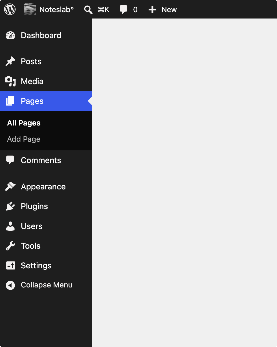
🔗 **Source:** [Replacing Dashicons in the Admin Bar and Menu](https://make.wordpress.org/core/2026/09/04/replacing-dashicons-in-the-admin-bar-and-menu/)
> [!note]+ Document Notes
> tags: [wordpress-core, accessibility, dashicons, icon-fonts, svg-icons, wp-get-icon, design-system, forced-colors, screen-readers, trac-65089, admin-ui]
> title: Replacing Dashicons in the admin bar and menu
> author: Joen Asmussen
> source: "Make WordPress Core"
> reference: https://make.wordpress.org/core/2026/09/04/replacing-dashicons-in-the-admin-bar-and-menu/
> date created: 2026-09-04 10:12
>
> > [!info] Generated analysis — not the author's words. Sections below are machine-written
> > from the captured source. Only text inside `> [!quote]` blocks is verbatim from the author.
> > Do not quote or attribute any other line to the named author.
>
> > [!warning] Provenance
> > **Byline recovered, not supplied.** Reader recorded the author as `make.wordpress.org`. The post body carries the CSS class `author-joen`, so this is **Joen Asmussen** (@jasmussen), WordPress design lead. "Xilonz" and "Drivingralle" also appear in the fetched page — those are *commenters* in the comment JSON, not co-authors.
> > **The post is well-cited.** Ten outbound links: Trac #65089 (twice), PR wordpress-develop#12270, the WP 7.1 `wp_get_icon()` announcement, the Gutenberg icon library, three contributor profiles, and two images. Any "unsourced" reading of this post would be an artifact of `<a>`-stripping, not the post.
> > **The "After" image is a mockup**, and the author says so. Do not treat it as shipped UI.
> > ~470 words. Short by design — it's a call for feedback on work already six weeks old, not a decision record.
>
> # 🏷️ Title: Replacing Dashicons in the admin bar and menu
>
<!-- deep-read:sections start -->
## 🧭 Table of Contents
- [📝 Summary](#-summary)
- [📖 Main Content](#-main-content)
- [🗒️ Notes](#️-notes)
- [📚 References](#-references)
- [🗣️ Paraphrase](#️-paraphrase)
- [📰 Newsletter](#-newsletter)
- [✅ Action Items](#-action-items)
- [🧪 Hypotheses](#-hypotheses)
- [📊 Methodology](#-methodology)
- [❓ Questions](#-questions)
- [🔮 Future Research](#-future-research)
- [💡 Implications](#-implications)
- [🧠 Learning Styles Assessment](#-learning-styles-assessment)
- [📊 Accessibility Assessment](#-accessibility-assessment)
- [🌍 DEIB Assessment](#-deib-assessment)
- [✅ Logical Validity](#-logical-validity)
- [🛡️ DARVO Analysis](#️-darvo-analysis)
- [🎯 Conclusion](#-conclusion)
- [🧱 Refactor Appendix](#-refactor-appendix)
- [🧰 Template Library](#-template-library)
### 🔗 References (in-page)
- Source: https://make.wordpress.org/core/2026/09/04/replacing-dashicons-in-the-admin-bar-and-menu/
- Trac ticket #65089 (the feedback venue): https://core.trac.wordpress.org/ticket/65089
- Pull request (code review only): https://github.com/WordPress/wordpress-develop/pull/12270
- `wp_get_icon()` introduced in WP 7.1: https://make.wordpress.org/core/2026/07/24/registering-and-rendering-svg-icons-in-wordpress-7-1/
- Gutenberg icon library: https://wordpress.github.io/gutenberg/?path=/story/icons-icon--library
- Props: https://profiles.wordpress.org/fushar/ · https://profiles.wordpress.org/wildworks/ · https://profiles.wordpress.org/lucasmdo/
- Before/after images: https://make.wordpress.org/core/files/2026/09/before.png · https://make.wordpress.org/core/files/2026/09/after.png
## 📝 Summary
**What happened.** A patch open since June (Trac #65089) replaces Dashicons in the WordPress admin bar and admin sidebar menu with the WordPress (Gutenberg) icon set, rendered through `wp_get_icon()` — the SVG icon API that landed in WordPress 7.1. Joen Asmussen posted it to Make/Core on 2026-09-04 to widen the audience before it ships, on the reasoning that a change this visible deserves more eyes than a Trac ticket gets. Props to @fushar, @wildworks, and @lucasmdo.
**Why it matters.** The argument is not aesthetic, and that's the notable part. Four reasons are given, three of them accessibility defects intrinsic to *the icon-font technique itself* rather than to Dashicons' drawings:
1. **Icon fonts are announced unpredictably.** Glyphs map to Unicode Private Use Area code points, which carry no defined meaning, so screen readers vary — silence, a nonsense character, or punctuation read mid-sentence.
2. **Icon fonts break under user colour overrides.** Windows High Contrast / forced-colours modes make font-based icons vanish or misrender, because the OS treats the icon as text.
3. **Webfont failure is confusing.** A blocked or slow font file leaves tofu boxes or wrong glyphs — visible garbage that reads as a broken site. An SVG either renders or is absent.
4. **One icon set beats two.** A unified visual language is a small change that helps people with perception and information-processing differences.
**Stakeholders.** Core committers and the Design team (owning the mapping); the Accessibility team (the case being made is theirs); plugin and theme authors who register admin-menu icons via Dashicons class names; anyone shipping admin UI that visually matches the current chrome; and users of forced-colours modes and screen readers, who are the beneficiaries.
**Risks and tradeoffs.** The post asks for feedback on the icon *mapping*, and names two open questions itself: the search icon faces the opposite direction from the Dashicon it replaces, and the Posts icon may move from a pin to a quill pen. Unaddressed in the post: what happens to the thousands of plugins passing `dashicons-*` class names to `add_menu_page()`, whether Dashicons stays loaded (and at what page-weight cost), and whether any third-party admin CSS keyed to the font breaks.
**Bottom line.** This is a well-argued accessibility-motivated change presented as a design change, with a real feedback ask and a named venue. The technical case against icon fonts is sound and long-established. The unanswered question is the compatibility surface, which the post doesn't raise at all — and in WordPress that is usually the question that decides the timeline.
## 📖 Main Content
**The framing move is the interesting one.** Asmussen could have justified this as "the new icons look better" and mostly been believed. Instead the post spends its whole middle section on failure modes of the *technique*: PUA code points with no semantics, OS-level forced-colours handling, and webfont load failure. That reframes a visual refresh as remediation, which changes who has standing to object. An aesthetic change invites taste arguments; a stated accessibility defect asks objectors to argue that the defect doesn't matter.
**What `wp_get_icon()` buys.** The July 2026 announcement introduced registering and rendering SVG icons in Core. This patch is the first high-visibility *consumer* of that API — which is the normal shape of platform work: ship the primitive one release, migrate a marquee surface the next. It also means the admin bar and menu become a live proof that the primitive is sufficient, or a live demonstration of what it's missing.
**`currentColor` is the load-bearing detail.** The post's second reason turns on SVGs drawn with `currentColor` inheriting the user's chosen colours. That is the mechanism by which forced-colours support becomes automatic rather than a per-icon fix. It's one clause in the post and it's doing most of the accessibility work.
**The two open questions are unequal.** The search-icon direction is a genuine design question with a stated cheap fix ("we can add an additional variant"). The Posts pin-vs-quill question is larger than it looks: the pin has been the Posts icon long enough to be a recognition anchor for anyone who administers WordPress daily, and swapping a familiar icon has a relearning cost that the accessibility argument doesn't cover. The post's own before/after mockup takes a position (quill) without arguing for it.
**Feedback routing is explicit and worth respecting.** Comments to Trac #65089, not the PR, not the post — the PR is for code review with "discussion kept on the ticket." That's a deliberate single-venue choice, and it's the actionable instruction in the post.
### 🗒️ Notes
- **The accessibility case is standard and correct.** The screen-reader/PUA problem, forced-colours breakage, and tofu-on-font-failure are the three canonical arguments against icon fonts, and have been for roughly a decade. Nothing here is novel; that it's now motivating a Core change is the news.
- **"No font changes are being proposed"** — the author preempts a likely misreading of the mockup, where font smoothing makes the After image look different. Worth quoting when someone reads the image as a typography change.
- **Props are to three contributors, and the author isn't claiming the work.** @fushar, @wildworks, @lucasmdo moved it forward; Asmussen is amplifying. Attribute the patch to them, not to the post's author.
- **"Since June" to a September post is a ~10-week visibility gap** for a change the author himself calls "very visible." That gap is the implicit process finding: Trac tickets don't surface high-blast-radius UI changes on their own, and it took a Make post to widen the audience.
- **The compatibility question is absent, not answered.** No mention of `dashicons-*` class names in `add_menu_page()`, no mention of whether the Dashicons stylesheet keeps loading, no deprecation language. For a change to the admin menu — one of the most-extended surfaces in WordPress — that silence is the biggest gap in the post.
- **Scope is narrow and stated:** admin bar and sidebar menu. Not the whole admin, not the editor, not front-end. Don't over-read it as "WordPress is dropping Dashicons."
## 📚 References
Primary sources, in the order the post cites them:
- **Trac #65089** — the ticket, and the designated feedback venue. https://core.trac.wordpress.org/ticket/65089
- **wordpress-develop PR #12270** — the implementation, open for code review. https://github.com/WordPress/wordpress-develop/pull/12270
- **"Registering and rendering SVG icons in WordPress 7.1"** (Make/Core, 2026-07-24) — the `wp_get_icon()` API this patch consumes. https://make.wordpress.org/core/2026/07/24/registering-and-rendering-svg-icons-in-wordpress-7-1/
- **Gutenberg icon library** — the icon set being adopted. https://wordpress.github.io/gutenberg/?path=/story/icons-icon--library
- **Contributor profiles** — @fushar, @wildworks, @lucasmdo.
Secondary/context worth pulling in that the post does *not* cite: WCAG 2.2 SC 1.1.1 (Non-text Content) and SC 1.4.11 (Non-text Contrast); the CSS `forced-colors` media feature spec; and the WordPress Accessibility team's handbook guidance on icon usage. The post makes accessibility claims without citing a standard — defensible for a Make post aimed at practitioners, but a reader wanting to verify has nowhere to click.
## 🗣️ Paraphrase
**Opening.** A patch has been in progress since June that swaps Dashicons for WordPress icons in the admin bar and sidebar, using `wp_get_icon()` from WP 7.1. Three contributors moved it forward. Because the change is very visible, it needs a wider audience than it has had.
**The before/after.** The change reduces to a pair of images. The After image is a mockup; font smoothing makes it look slightly different, but no font changes are proposed.
**Why replace them.** Dashicons has served WordPress well, but it is an icon font, and icon fonts carry intrinsic downsides worth addressing in any new icon effort.
**Reason one.** Icon fonts map glyphs to Unicode private-use-area code points that have no defined meaning, so screen readers handle them inconsistently — silence, a nonsense character, or punctuation read aloud mid-sentence. An SVG with an explicit `aria-label`, or explicitly hidden, is predictable in a way a glyph cannot be.
**Reason two.** Windows High Contrast Mode and other forced-colours settings routinely make font-based icons vanish or misrender, because the OS treats the icon as text. An SVG drawn with `currentColor` follows the user's chosen colours.
**Reason three.** When a webfont fails, the failure is confusing — a blocked or slow font file leaves tofu boxes or wrong glyphs, visible garbage that looks like a broken site. An SVG either renders or is absent.
**Reason four.** Unifying on a single icon set rather than two simplifies the visual language. Though a small visual change, it can be meaningful for people with perception and information-processing differences.
**Feedback.** Feedback is welcome, and some questions remain open. The search icon faces the opposite direction from the Dashicon it replaces; if that's meaningful, an additional variant can be added. The Posts icon could change from a pin — the ticket discusses options, and the before/after here suggests a quill pen. Beyond those, the whole mapping is worth a look, and adding icons is easy if the chosen ones aren't quite right. Feedback belongs on the Trac ticket so it stays in one place; the pull request is open for code review, with discussion kept on the ticket.
## 📰 Newsletter
**The admin menu is getting new icons, and the reason isn't that they're prettier**
WordPress is proposing to retire Dashicons from the admin bar and sidebar in favour of the Gutenberg icon set, rendered through `wp_get_icon()` — the SVG API that shipped in 7.1. The patch has been open since June as [Trac #65089](https://core.trac.wordpress.org/ticket/65089); Joen Asmussen [brought it to Make/Core](https://make.wordpress.org/core/2026/09/04/replacing-dashicons-in-the-admin-bar-and-menu/) this week specifically because a change this visible had been getting Trac-sized attention.
What makes the post worth your time is the argument. It's not "the new ones look better." It's that icon fonts are a broken delivery mechanism: they map glyphs to Unicode private-use code points that mean nothing, so screen readers improvise — sometimes silence, sometimes a stray piece of punctuation read into the middle of your sentence. They vanish under Windows High Contrast Mode, because as far as the OS is concerned an icon font is text. And when the font file is slow or blocked, you get tofu boxes, which look exactly like a broken site. An SVG with `currentColor` sidesteps all three.
If you administer WordPress daily, look at the mapping and say something — the search icon now faces the other way, and Posts may go from a pin to a quill pen. That last one is muscle memory for a lot of us. Feedback goes on [the Trac ticket](https://core.trac.wordpress.org/ticket/65089), not the [PR](https://github.com/WordPress/wordpress-develop/pull/12270), and not the post.
One thing the post doesn't address: every plugin that passes a `dashicons-*` class to `add_menu_page()`. If you maintain one, that's the question worth asking on the ticket.
## ✅ Action Items
**Courtney — personal (highest value, do this week):**
- Comment on Trac #65089 with the compatibility question the post omits: what happens to `dashicons-*` class names passed to `add_menu_page()`, and does the Dashicons stylesheet keep loading? This is a real gap and asking it is a genuine contribution.
- Check her own plugins — Post Kinds for IndieWeb, Outpost, Post Formats for Block Themes, Link Extension for XFN, Social Webmention Importer — for `dashicons-` menu icon registrations. This is a `grep` away and determines whether she has skin in the game.
**Accessibility team:** Weigh in on the ticket to make the forced-colours and screen-reader claims official rather than asserted in a Make post; consider whether this warrants handbook guidance discouraging icon fonts in admin UI generally.
**Design:** Own the mapping review; resolve pin-vs-quill with a stated rationale rather than letting the mockup decide by default; supply the reversed search-icon variant if the direction change is judged meaningful.
**Core:** Confirm the compatibility story for third-party `dashicons-*` registrations and state a deprecation posture, if any.
**Core Performance:** Measure whether Dashicons can stop loading on admin pages after this lands, and what that saves; if it must stay for back-compat, the accessibility win arrives without the weight win.
**Themes / Plugins:** Advise authors on whether admin-menu icon registration changes; the Plugins team may want a note in review guidance if a new API is preferred.
**Documentation:** Update the `add_menu_page()` reference and the Dashicons developer page once the direction is settled.
**Training:** The "why not icon fonts" argument is a ready-made teaching artifact for accessibility curriculum — three concrete failure modes with visible consequences.
**Meta / Mobile / Playground:** Not applicable to this source — the change is scoped to wp-admin chrome.
**Community / Marketing / Support / Polyglots / Photos / TV / CLI / Hosting / Tide / Openverse / Core AI / Core Program Team:** Not applicable to this source — no community, translation, media, or infrastructure surface is touched.
**The WPOCC:** Not applicable to this source — no governance or funding dimension.
**FAIR:** Not applicable to this source — no federated-repository dimension.
## 🧪 Hypotheses
1. **Forced-colours rendering measurably improves.** Admin bar and menu icons that currently disappear under Windows High Contrast Mode will render after the patch. Testable directly in a Windows VM with forced colours on, before and after.
2. **Screen-reader output becomes deterministic.** The stray-punctuation and silent-glyph behaviours vary today by AT and browser; after the change, output should be identical across NVDA/JAWS/VoiceOver because the accessible name is explicit rather than inferred from a PUA code point.
3. **The compatibility surface is larger than the post implies.** A scan of the plugin directory for `dashicons-` in `add_menu_page()` calls will return thousands of plugins, making a silent removal of the font infeasible.
4. **Recognition cost is real for the Posts icon.** Daily WordPress administrators asked to locate "Posts" in a screenshot will be measurably slower with the quill than with the pin, at least initially — the accessibility argument doesn't address relearning.
5. **The Make post outperforms the ticket for feedback volume.** Comment count on #65089 in the two weeks after 2026-09-04 will exceed the total from June through August, which would confirm that Trac alone under-surfaces high-visibility UI changes.
6. **Page weight does not drop.** Dashicons will still be enqueued after this ships, for back-compat, so the performance benefit is deferred indefinitely even though the accessibility benefit lands.
## 📊 Methodology
The post presents **no study, dataset, or measurement**. Its method is design rationale plus a before/after mockup — appropriate for a call-for-feedback post, and worth naming plainly because the accessibility claims are stated as established fact rather than demonstrated here.
The claims themselves rest on well-documented behaviour rather than on evidence supplied in the post:
- **PUA code points and AT behaviour** — a long-standing, reproducible finding in accessibility practice; verifiable directly with a screen reader.
- **Forced-colours breakage** — reproducible in Windows High Contrast Mode; also derivable from the `forced-colors` spec and how UA stylesheets treat text.
- **Webfont failure → tofu** — trivially reproducible by blocking the font request in devtools.
All three are cheap to verify empirically, which is the right standard here: this is a hypothesis about runtime behaviour, and the honest check is to fire it in a VM rather than to reason from the source. **No baseline measurement is offered** for the current state, and none for the proposed state, so "how much better" is unquantified.
## ❓ Questions
1. What happens to the thousands of plugins registering admin menus with `dashicons-*` class names — silent continuation, shim, or deprecation?
2. Does the Dashicons stylesheet stop loading, and if not, when? Is there a page-weight number attached to this change at all?
3. Was the accessibility case validated with actual screen-reader and forced-colours testing on the patch, or is it reasoning from known icon-font properties? (Both are legitimate; which one it is should be stated.)
4. Who decides pin-vs-quill for Posts, and on what criterion — recognisability, semantic fit, or set consistency?
5. Is the reversed search icon a genuine semantic change for right-to-left locales, where direction conventions differ?
6. Does the Gutenberg icon set have full coverage for every Dashicon currently used in the menu, or are there gaps being papered over by near-matches?
7. Why did a change the author calls "very visible" sit for ten weeks before a Make post — and what would surface the next one earlier?
8. Are there admin surfaces beyond the bar and menu on the same trajectory, and is there a stated end-state for Dashicons?
## 🔮 Future Research
- **A full inventory of Dashicons usage across the admin**, not just the bar and menu, to establish whether this is the first step of a deprecation or a one-surface improvement. The post takes no position and the difference matters to every plugin author.
- **Empirical AT testing matrix** — NVDA, JAWS, VoiceOver × Chrome, Firefox, Safari, before and after — to convert the screen-reader claim from established-practice reasoning into a WordPress-specific result. Relevant to the vault's existing claim that automated checks detect properties but cannot evaluate whether they serve anyone.
- **RTL locale review** of the icon mapping, particularly directional icons (search, arrows, quill). Directionality is where icon swaps usually break in non-English locales.
- **Cognitive/recognition study** on changing long-stable admin iconography — the "unifying the visual language helps perception and information-processing differences" claim is plausible but is the one claim in the post with no failure mode attached, and therefore the least falsifiable as written.
- **A general policy question:** should WordPress adopt a standing position against icon fonts in Core UI, making this the first application of a rule rather than a one-off patch?
## 💡 Implications
**For practice.** Plugin and theme authors who register admin menu icons should watch #65089 now rather than after it lands. Anyone whose admin CSS targets Dashicons glyph rules should assume that becomes fragile.
**For policy.** If Core accepts the argument that icon fonts are intrinsically an accessibility defect, the logical consequence extends past this patch to every icon font in the WordPress surface area, including those shipped by plugins. That's a larger commitment than the post asks for, and nobody has been asked to make it.
**For security.** No direct security dimension. A marginal supply-chain note: removing a webfont dependency removes one externally-loadable asset from the admin, though Dashicons is bundled rather than CDN-served, so the practical delta is near zero.
**For education.** This is an unusually clean teaching example — one decision, three named failure modes, each with a visible consequence and a concrete fix. It converts "use SVG not icon fonts" from folklore into an argument a developer can reconstruct.
**For funding/sustainability.** The work was done by three contributors over three months and needed a Make post to get attention. That's a visibility-of-contribution problem, not a code problem, and it's the kind of unglamorous maintenance labour that routinely goes unnoticed until someone amplifies it.
**For accessibility specifically.** The strongest implication: this reframes an aesthetic-looking change as remediation, which is exactly the move that gets accessibility work funded and shipped. The technique is worth reusing.
## 🧠 Learning Styles Assessment
- **Visual** — Well served. The before/after images carry the entire "what changes" burden, and the author flags the mockup caveat so the visuals aren't over-read.
- **Aural** — Poorly served. No audio, video, or narration. Ironically, a post about screen-reader output has no audio demonstration of the bad behaviour it describes; a ten-second clip of NVDA reading a PUA glyph would be the single most persuasive artifact available.
- **Verbal (read/write)** — Well served. This is the post's native mode: four clearly labelled reasons in parallel structure, each a claim plus a mechanism plus a contrast with the SVG alternative.
- **Kinesthetic** — Partly served. There's a real action to take (comment on the ticket) and a patch to check out and run, but no step-by-step "try this yourself" — e.g. how to enable forced colours and see the breakage.
- **Logical** — Well served. The argument is structured as: technique has property → property causes failure → alternative lacks property. Each reason is independently evaluable.
- **Social** — Well served. Explicit feedback request, a named single venue, props to three contributors, and two open questions posed as genuine questions rather than rhetorical ones.
- **Solitary** — Well served. Short, self-contained, linked to primary sources for anyone who wants to go deeper alone.
- **Naturalistic** — Not applicable to this source — no environmental, ecological, or pattern-in-nature dimension to an admin icon change.
**Reading level:** roughly grade 11–13 (upper secondary to early undergraduate). Sentence structure is plain and mostly short, but comprehension requires knowing what an icon font, a Unicode private-use-area code point, `currentColor`, forced-colours mode, and a webfont are. A non-developer WordPress administrator — the person most affected by the visual change — would follow the *what* and lose the *why*.
## 📊 Accessibility Assessment
Assessed against WCAG 2.2 Level AA, treating the *proposed change* as the artifact:
1. **Perceivable — 1.1.1 Non-text Content (A).** Directly improved. The core defect named is that a PUA glyph has no reliable accessible name; an SVG with an explicit `aria-label`, or explicitly hidden when decorative, satisfies 1.1.1 predictably. This is the post's strongest and best-argued point.
2. **Perceivable — 1.4.3 Contrast (Minimum) (AA) / 1.4.11 Non-text Contrast (AA).** Improved indirectly. `currentColor` means icons inherit whatever palette the user forces, so contrast follows the user's own setting rather than a hard-coded value. 1.4.11 specifically covers icons as non-text content requiring 3:1 — worth verifying against the new set, which the post doesn't do.
3. **Perceivable — 1.4.12 Text Spacing (AA).** Marginally relevant. An icon font is text to the layout engine, so user text-spacing overrides can shift icon positioning in ways SVG does not. Not mentioned in the post; a real if minor additional argument for the change.
4. **Operable — 2.4.7 Focus Visible (AA) / 2.4.11 Focus Not Obscured (AA, new in 2.2).** Unaddressed and worth raising. Admin bar and menu items are focusable; swapping the icon rendering shouldn't affect focus indicators, but "shouldn't" is an inference about runtime from source, and the mockup shows no focus state at all.
5. **Understandable — 3.2.3 Consistent Navigation (AA) / 3.2.4 Consistent Identification (AA).** The risk column. Changing the Posts icon from a pin to a quill alters a long-stable identification cue. 3.2.4 concerns consistency *within* a site, so a wholesale swap doesn't violate it — but the relearning cost is real and falls hardest on users with cognitive disabilities, which cuts against reason four's framing.
6. **Robust — 4.1.2 Name, Role, Value (A).** Improved for the same reason as 1.1.1: an explicit accessible name replaces an inferred one.
7. **Forced-colours / user-override support.** Not a numbered SC but the practical heart of the post, and adjacent to 1.4.3. This is where the change delivers the most for the users most affected.
**Overall:** the change is a net accessibility improvement with one under-examined regression risk (icon recognisability under 3.2.4-adjacent reasoning). Notably, none of these WCAG references appear in the post itself — the accessibility case is made in practitioner terms without standards citations, which weakens it exactly where it would be strongest.
## 🌍 DEIB Assessment
- **Cultural breadth.** Thin. Icon semantics are culturally variable — a quill pen as "writing" carries a Western, historically specific connotation, and directional icons (the reversed search icon) behave differently in RTL locales. Neither is raised. For software translated into 200+ locales, that's a real gap in a post asking for feedback on an icon *mapping*.
- **Inclusive language.** Good. Plain, non-jargon-heavy where it can be, no ableist idiom, no metaphor doing work a literal phrase could do. "People with perception and information-processing differences" is person-first and avoids deficit framing.
- **Neurodiversity support.** Explicitly considered, and this is to the post's credit — reason four names perception and information-processing differences as beneficiaries of a unified visual language. The countervailing point (that changing familiar icons imposes a relearning cost on the same group) isn't raised, so the treatment is one-sided rather than absent.
- **Representation.** Props to three named contributors with linked profiles; the post amplifies others' work rather than claiming it. No demographic dimension is visible or relevant in the text.
- **Psychological safety.** High. Open questions are posed as genuinely open, the fix for disagreement is stated as cheap ("it's easy to add icons if the ones chosen are not quite there yet"), and feedback is routed to a named public venue. The tone invites disagreement rather than defending a decision — which is the correct register for a pre-decision post.
## ✅ Logical Validity
**Strong reasoning:**
- The four reasons are **independent** — each stands if the others fail — and each pairs a mechanism with a consequence rather than asserting a preference. That's the structure of a good technical argument.
- The **contrast class is correct**: each reason compares icon-font behaviour to SVG behaviour on the same axis, rather than comparing old drawings to new drawings.
- The author **preempts a foreseeable misreading** ("no font changes are being proposed") and **flags the evidence's limits** ("the After image is a mockup"). Both are marks of good faith and both reduce the chance of a bad-faith reading.
- **Open questions are genuinely open**, with a stated remedy for each.
**Fallacies and weak points:**
- **Suppressed evidence (omission), in "Why replace them."** The section lists only costs of icon fonts and only benefits of SVG. Real costs of the change — back-compat for `dashicons-*` registrations, relearning familiar icons, possible sprite/request overhead — are absent. *Fix:* add a short "costs and mitigations" paragraph; it would strengthen the case, not weaken it, because the costs are manageable and readers will find them anyway.
- **Equivocation on "small," in reason four.** "Although a small visual change, it can be meaningful for people with perception and information-processing differences." *Small* to a designer comparing icon sets is not *small* to a user relearning which shape means Posts. The sentence uses the change's smallness to license the benefit while the same smallness is what makes the relearning cost tolerable — those pull in opposite directions and neither is quantified. *Fix:* separate the two claims and attach the benefit to unification specifically, not to the change's size.
- **Appeal to the mockup, in the Feedback section.** "The before and after shown in this post suggests using the quill pen icon." The mockup is presented as evidence for a decision the post simultaneously says is open. An illustration is not an argument. *Fix:* state the rationale for the quill, or show the pin in the mockup and let the ticket decide.
- **Unsupported generalisation, minor.** "Screen readers handle them inconsistently" is true and well-established but uncited here; a reader who doubts it has nowhere to go. *Fix:* one link to AT testing or the WCAG SC.
**Tone of voice:** Measured, collegial, and low-ego. Credits others first, concedes the mockup's limits, asks rather than announces, and routes disagreement to a public venue. It reads like someone who expects to be argued with and considers that the point. No hedging-as-evasion, no marketing register, no false urgency.
## 🛡️ DARVO Analysis
**Not applicable to this source** — DARVO (Deny, Attack, Reverse Victim and Offender) describes a defensive response to accusation, and there is no accusation, conflict, or grievance in this post.
For completeness, each element checked and absent:
- **Deny** — nothing is denied. The post concedes points against itself (the mockup caveat, the open questions, "Dashicons has served WordPress well for a long time" as explicit credit to the thing being replaced).
- **Attack** — no person, team, or prior decision is criticised. Dashicons' limitations are attributed to the *icon-font technique*, not to the people who chose it, and the sentence introducing those limitations opens with praise.
- **Reverse Victim and Offender** — no victim/offender framing exists to reverse. The affected parties (screen-reader and forced-colours users) are described as beneficiaries of a fix, not as claimants against anyone.
The absence is worth recording rather than skipping: a post proposing to replace a long-standing colleague-built asset is a place where defensive framing *could* appear, and it doesn't.
## 🎯 Conclusion
**Bottom line.** A six-week-old patch (Trac #65089) replacing Dashicons with `wp_get_icon()`-rendered SVG icons in the admin bar and sidebar, surfaced to Make/Core for wider feedback before it ships. The case is accessibility-first and technically sound: PUA code points break screen-reader output, icon fonts vanish under forced colours, and webfont failure produces tofu. The framing — remediation, not redesign — is the most transferable thing in the post. Its weakest point is what it leaves out: no mention of the `dashicons-*` back-compat surface, no WCAG citations, and a mockup quietly deciding an explicitly open question.
**Next steps.**
1. Grep Courtney's five plugin repos for `dashicons-` admin menu registrations to establish whether she's affected.
2. Comment on #65089 with the back-compat question — it's the genuine gap and it's a real contribution.
3. Watch whether Dashicons stops being enqueued; that's the difference between an accessibility win and an accessibility-plus-performance win.
4. Verify the forced-colours claim empirically in a Windows VM before repeating it as fact — it's a runtime claim, and firing it beats reasoning about it.
## 🧱 Refactor Appendix
### Literature Split Pad
**Proposed Literature Note:** `Replacing Dashicons in the admin bar and menu`
- Bib capsule: Asmussen, Joen. "Replacing Dashicons in the admin bar and menu." Make WordPress Core, 2026-09-04.
- Author's thesis (Adler Q1: what is it about?) — WordPress should stop rendering admin chrome icons with an icon font, because the font *technique* has three concrete accessibility failure modes that SVG does not.
- (Adler Q2: what is said in detail?) — Four parallel reasons: unpredictable AT announcement from PUA code points; forced-colours breakage; confusing webfont-failure state; visual-language unification. Plus two open mapping questions and a single named feedback venue.
- Key arguments (≤3): (1) the defect is in the technique, not the drawings; (2) `currentColor` makes user-colour-override support automatic; (3) the mapping is still negotiable and cheap to change.
#### Claim atoms (H3 candidates)
### An icon font's accessible name is inferred, an SVG's is declared
> [!quote] ID:rw_01m1pc330t8v7hrt0ekjfc5ta7
> Icon fonts map glyphs to Unicode private-use-area code points, which have no defined meaning. Screen readers handle them inconsistently, sometimes with silence, sometimes with a nonsense character or a piece of punctuation read aloud mid-sentence.
Where: "Why replace them," reason one. Why it matters: this is the general principle — a rendering technique that requires assistive technology to *infer* meaning will fail unpredictably, while one that *declares* it will not. Generalises past icons to any glyph-as-semantics pattern.
<!-- atomicity: 1 idea ✓ -->
### Rendering text-as-graphic forfeits the user's colour overrides
> [!quote] ID:rw_01m1pc330t8v7hrt0ekjfc5ta7
> Windows High Contrast Mode and other forced-colours settings routinely make font-based icons vanish or misrender, because the icon is text as far as the OS is concerned. An SVG drawn with currentColor follows the user's chosen colours.
Where: reason two. Why it matters: the OS's category for a thing determines which user preferences reach it. Choosing the wrong category silently opts users out of accommodations they've already configured.
<!-- atomicity: 1 idea ✓ -->
### A failure that renders garbage is worse than one that renders nothing
> [!quote] ID:rw_01m1pc330t8v7hrt0ekjfc5ta7
> A blocked or slow font file leaves tofu boxes or wrong glyphs, visible garbage that looks like a broken site. An SVG either renders or is absent.
Where: reason three. Why it matters: a design principle beyond icons — prefer failure modes that are legible as absence over ones that are legible as breakage, because the second destroys trust in everything around it.
<!-- atomicity: 1 idea ✓ -->
#### Permanent Note candidates
1. **"A Rendering Technique That Infers Semantics Fails Unpredictably Where One That Declares Them Does Not"** — the generalised form of atom 1. Check against existing [[Detecting a Property Is Not Evaluating Whether It Serves Anyone]] (created 2026-09-04, adjacent but distinct: that one is about *checking*, this is about *rendering*) and [[Client-Supplied Hints Are Not Security Boundaries]] (same shape, security domain).
2. **"Choosing the Wrong OS-Level Category Silently Opts Users Out of Accommodations They Already Configured"** — atom 2 generalised. Strong candidate; check against [[Accessibility Enforced at Authoring Time Beats Post-Hoc Auditing]].
3. **"Framing Remediation as Remediation Changes Who Has Standing to Object"** — not stated in the post; it's the *method* the post demonstrates. Possibly the most reusable idea here for Courtney's own advocacy work. Check for duplication against [[Advocacy Needs Disclosure When the Messenger Sells the Product]] (different claim) before creating.
**Recommendation:** hold all three for the next synthesis pass rather than creating now — candidate 3 is the highest-resonance and needs a second source before it's more than a single-instance observation.
### Fleeting Queue
- Grep own plugins for `dashicons-` — 5 repos, one command. Do before commenting on the ticket.
- Ten-week gap between patch and Make post: is there a general "high-blast-radius changes need a visibility trigger" pattern in WP Core? Watch for a second instance.
- The missing audio demo — a ten-second NVDA clip would be the most persuasive artifact and nobody made one. Possible small contribution.
- RTL/i18n review of directional icons is unclaimed work on this ticket.
<!-- deep-read:sections end -->
📄 **Full text:** [[Full Document Contents/Articles/Replacing Dashicons in the Admin Bar and Menu.md|Replacing Dashicons in the Admin Bar and Menu by Joen Asmussen]]
## Highlights
- **Icon fonts are announced unpredictably.** Icon fonts map glyphs to Unicode private-use-area code points, which have no defined meaning. Screen readers handle them inconsistently, sometimes with silence, sometimes with a nonsense character or a piece of punctuation read aloud mid-sentence. An SVG with an explicit `aria-label`, or explicitly hidden, is predictable in a way a glyph cannot be. ([View Highlight](https://read.readwise.io/read/01m1pce3h1b2f6q65av30dk7z7))
- Note: The generalizable atom: a rendering technique that requires assistive tech to INFER meaning fails unpredictably; one that DECLARES it does not. Generalizes past icons to any glyph-as-semantics pattern. WCAG 2.2 SC 1.1.1 / 4.1.2.
- Tags: atom/zettel/z1, atom/literature/h1
- **Icon fonts break under user colour overrides.** Windows High Contrast Mode and other forced-colours settings routinely make font-based icons vanish or misrender, because the icon is text as far as the OS is concerned. An SVG drawn with `currentColor` follows the user’s chosen colours. ([View Highlight](https://read.readwise.io/read/01m1pcebh74gc42j4ykh7cjkcq))
- Note: The load-bearing accessibility detail, in one clause: currentColor is what makes forced-colours support automatic rather than a per-icon fix. General principle — the OS's category for a thing decides which user preferences reach it, so the wrong category silently opts users out of accommodations they already configured.
- Tags: atom/zettel/z1, atom/literature/h1
- **When a webfont fails, the failure is confusing.** A blocked or slow font file leaves tofu boxes or wrong glyphs, visible garbage that looks like a broken site. An SVG either renders or is absent. ([View Highlight](https://read.readwise.io/read/01m1pcehzpdvztrk7b4tq6tvve))
- Note: Design principle well beyond icons: prefer failure modes legible as ABSENCE over ones legible as BREAKAGE — the second destroys trust in everything around it.
- Tags: atom/literature/h2, atom/zettel/z1
- Feedback is best left on [the Trac ticket](https://core.trac.wordpress.org/ticket/65089), so that it stays in one place. The [pull request](https://github.com/WordPress/wordpress-develop/pull/12270) is open for code review, with discussion kept on the ticket. ([View Highlight](https://read.readwise.io/read/01m1pcestja02jsp3nb88kwcf4))
- Note: ACTION: comment on Trac #65089 (not the PR) with the back-compat question the post omits — what happens to plugins passing dashicons-* class names to add_menu_page(), and does the Dashicons stylesheet keep loading? Grep own plugin repos for `dashicons-` first.
- Tags: action/h1