Typography, Readability and Digital Accessibility
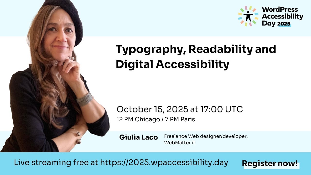
🔗 **Source:** [Typography, Readability and Digital Accessibility](https://www.youtube.com/watch?v=ZTd9UcH1Zes)
> [!note]+ Document Notes
> tags: [typography, readability, web-accessibility, wcag, dyslexia-myths]
> author: Giulia Laco
> source: WordPress Accessibility Day 2025 (WPA11yDay)
> reference: https://www.youtube.com/watch?v=ZTd9UcH1Zes
> date created: 2026-09-08
>
> > [!info] Generated analysis — not the author's words. Sections below are machine-written
> > from the captured source. Only text inside `> [!quote]` blocks is verbatim from the author.
> > Do not quote or attribute any other line to the named author.
>
> # 🏷️ Title: Typography, Readability and Digital Accessibility
>
<!-- deep-read:sections start -->
## 🧭 Table of Contents
- [📝 Summary](#-summary)
- [📖 Main Content](#-main-content)
- [🗒️ Notes](#️-notes)
- [📚 References](#-references)
- [🗣️ Paraphrase](#️-paraphrase)
- [📰 Newsletter](#-newsletter)
- [✅ Action Items](#-action-items)
- [🧪 Hypotheses](#-hypotheses)
- [📊 Methodology](#-methodology)
- [❓ Questions](#-questions)
- [🔮 Future Research](#-future-research)
- [💡 Implications](#-implications)
- [🧠 Learning Styles Assessment](#-learning-styles-assessment)
- [📊 Accessibility Assessment](#-accessibility-assessment)
- [🌍 DEIB Assessment](#-deib-assessment)
- [✅ Logical Validity](#-logical-validity)
- [🛡️ DARVO Analysis](#-darvo-analysis)
- [🎯 Conclusion](#-conclusion)
### 🔗 References
- [WCAG 2.2 Success Criterion 1.4.3 Contrast (Minimum)](https://www.w3.org/WAI/WCAG22/Understanding/contrast-minimum.html)
- [WCAG 2.2 Success Criterion 1.4.4 Resize Text](https://www.w3.org/WAI/WCAG22/Understanding/resize-text.html)
- [WCAG 2.2 Success Criterion 3.1.1 Language of Page](https://www.w3.org/WAI/WCAG22/Understanding/language-of-page.html)
- [WCAG 2.2 Success Criterion 3.1.5 Reading Level](https://www.w3.org/WAI/WCAG22/Understanding/reading-level.html)
- [If on a Winter's Night a Traveler, Italo Calvino (trans. William Weaver)](https://en.wikipedia.org/wiki/If_on_a_winter%27s_night_a_traveler)
## 📝 Summary
- Giulia Laco, an Italian web designer/developer working since the mid-90s and now a CSS, web typography, and semantic HTML consultant/trainer, gave this session at WordPress Accessibility Day 2025, introduced by emcee Jessica Sams.
- She builds a three-part model — visibility, legibility, readability — and ties each to a specific mechanical or WCAG cause: contrast and font size (visibility), letterform anatomy and spacing (legibility), and layout/typeset craft (readability).
- Key stakeholders: WordPress theme and plugin designers, front-end developers who set `font-size`, accessibility auditors, and readers with low vision, dyslexia, or other neurodivergences who depend on browser-level text resizing.
- The central risk she flags is fixed-unit (`px`) font sizing: it silently blocks a user's browser font-size preference, which she treats as a bigger practical failure than any single typeface choice.
- Bottom line: accessible typography is a chain of specific, checkable decisions — contrast ratio, relative units, aperture width, letter spacing, line length, and paragraph balance — not a vague design instinct.
## 📖 Main Content
Laco frames "visual reading" as an active, physical-then-mental process and walks through it in the order the eye and brain actually perform it, before mapping the results onto WCAG language.
Physically, the eye doesn't scan text smoothly. It alternates **fixations** (pauses of roughly a quarter-second on a cluster of letters) and **saccades** (fast jumps between fixations), moving both across a line and down to the next one, with **regressions** — backward re-reads — when comprehension falters. Each fixation is sharp only at its center (**foveal acuity**, named for the fovea, the retina's highest-density light-receptor zone) and blurs outward. She cites typographer Bruno Maag's estimate that a fixation captures 7–9 characters. She then cites a diagram by reading researcher Sofie Beier showing letter recognition and word recognition running in parallel — her explanation for why lowercase text reads faster than all caps: readers pattern-match whole word shapes, not letter-by-letter.
She layers in Zuzana Licko's theory of typeface exposure — "Readers read best what they read most" — demonstrating it by setting the same sentence in Helvetica, Georgia, Garamond, Verdana, and Montserrat (all easy), then in Totally Gothic (illegible to most, because it's unfamiliar, not because it's objectively worse).
From there she defines three terms with distinct questions: **visibility** ("can you see it?" — contrast and font size, WCAG 1.4.3/1.4.6 and the large-text carve-out), **legibility** ("can you read it?" — letterform anatomy: apertures, kerning vs. letter-spacing, confusable character pairs like 0/O, rn/m, b/d/p/q), and **readability** ("can you comfortably read this?" — split into content readability, governed by WCAG 3.1.1 Language of Page and 3.1.5 Reading Level, and typographic readability, governed by alignment, line length, and paragraph balance).
Practical guidance follows directly from the model: left-align (predictable line starts), hyphenate justified text to avoid "rivers," keep measure near Bringhurst's 66-character ideal (45–75 range), balance character size/line height/line length together (Matej Latin's equilateral-triangle metaphor, Richard Rutter's three-legged-stool metaphor), and — repeated twice, once in the talk and once in Q&A — never set `font-size` in fixed units, because it blocks the browser-level resize path that WCAG 1.4.4 depends on.
### 🗒️ Notes
#### ⏱️ [00:00:00](https://www.youtube.com/watch?v=ZTd9UcH1Zes&t=0s) Sponsors and introduction
- WordPress Accessibility Day 2025. Platinum sponsors named: Gravity Forms, WP Engine, Woo. Gold sponsors include Ally Web Accessibility, Equalize Digital, GoDaddy, GreenGeeks, Yoast.
#### ⏱️ [00:01:33](https://www.youtube.com/watch?v=ZTd9UcH1Zes&t=93s) Jessica Sams introduces Giulia Laco
- Emcee Jessica Sams (virtual public engagement specialist / UX designer, SWCA Environmental Consultants) introduces the session.
- Bio: background in humanities, logic, and linguistics; consultant/trainer; expertise in semantic HTML, SEO, UX, web typography, web fonts, CSS.
#### ⏱️ [00:03:00](https://www.youtube.com/watch?v=ZTd9UcH1Zes&t=180s) Giulia's opening
- Greets the audience from Italy; thanks the WordPress Accessibility Day team for the 24-hour event.
#### ⏱️ [00:04:25](https://www.youtube.com/watch?v=ZTd9UcH1Zes&t=265s) "The web was born accessible"
- Web designer/developer since the mid-90s. States the core principles the web was built on remain valid today, and calls the web "born accessible."
- Also works as a consultant and trainer on CSS, web typography, web fonts, semantic HTML.
#### ⏱️ [00:05:05](https://www.youtube.com/watch?v=ZTd9UcH1Zes&t=305s) Defining visual reading
- Reading is one modality among several (Braille via touch, screen readers via hearing); visual reading is the session's focus.
- Defines it as active engagement — extracting meaning from text, not passive scanning.
#### ⏱️ [00:06:26](https://www.youtube.com/watch?v=ZTd9UcH1Zes&t=386s) Calvino's opening lines as a reading-experience example
- Reads the opening of Italo Calvino's *If on a Winter's Night a Traveler* (trans. William Weaver): "Relax. Concentrate. Dispel every other thought. Let the world around you fade."
- Uses it to argue that reading requires a deliberate physical and mental state, not just visual input.
#### ⏱️ [00:08:16](https://www.youtube.com/watch?v=ZTd9UcH1Zes&t=496s) Three factor categories
- Organizes the influences on visual reading into common factors, personal conditions, and typographic properties.
#### ⏱️ [00:08:40](https://www.youtube.com/watch?v=ZTd9UcH1Zes&t=520s) Common factors in reading
- Situational: reading distance, paper vs. screen, ambient light, screen brightness, environment noise.
- Attitudinal: mental focus, mood, and the type of text (title, long-form, a menu voice label).
#### ⏱️ [00:09:32](https://www.youtube.com/watch?v=ZTd9UcH1Zes&t=572s) Personal conditions
- Age, reading proficiency, first vs. second language competence, interest and motivation.
- Visual impairments and neurodivergences named explicitly: memory issues, dyslexia, ADHD, ASD, epilepsy, migraine, anxiety, fatigue.
#### ⏱️ [00:10:54](https://www.youtube.com/watch?v=ZTd9UcH1Zes&t=654s) Typographic properties
- Typeface (calls it "the most important"), color contrast, font style (bold/italic), font size, paragraph length, spacing (line/character/word), character width, and rhythm.
#### ⏱️ [00:12:24](https://www.youtube.com/watch?v=ZTd9UcH1Zes&t=744s) Fixations, saccades, and regression
- Fixations last roughly a quarter-second on a cluster of letters; saccades are the quick jumps between them, horizontal and vertical.
- Regression: readers jump back to re-read text when comprehension is in doubt — described as common experience.
#### ⏱️ [00:14:08](https://www.youtube.com/watch?v=ZTd9UcH1Zes&t=848s) Foveal acuity
- Fovea = highest-density light-receptor zone of the macula (retina center); acuity is sharp at the fixation center and blurs outward.
- Frames focusing as intentional — the reader chooses what to sharpen.
#### ⏱️ [00:15:58](https://www.youtube.com/watch?v=ZTd9UcH1Zes&t=958s) Bruno Maag: 7–9 characters per fixation
- Cites typographer Bruno Maag's calculation that the ideal fixation captures 7 to 9 characters, calling it "a very brilliant calculation" without describing his method or dataset (see Logical Validity → Fallacies).
#### ⏱️ [00:16:38](https://www.youtube.com/watch?v=ZTd9UcH1Zes&t=998s) Sofie Beier's letter/word recognition diagram
- Shows parallel processing: letter detection and word-shape recognition happen together, and word-shape memory speeds recognition.
- Her explanation for why lowercase reads faster than all caps — readers memorize word shapes like ideograms.
#### ⏱️ [00:18:05](https://www.youtube.com/watch?v=ZTd9UcH1Zes&t=1085s) Zuzana Licko: typeface exposure
- Quotes type designer Zuzana Licko: "Readers read best what they read most."
- Demonstrates with the same sentence set in Helvetica, Georgia, Garamond, Verdana, Montserrat (all legible) vs. Totally Gothic (illegible — unfamiliar, not objectively broken).
#### ⏱️ [00:19:20](https://www.youtube.com/watch?v=ZTd9UcH1Zes&t=1160s) Visibility, legibility, readability defined
- Visibility answers "can you see it?" — built on color contrast and font size.
#### ⏱️ [00:20:34](https://www.youtube.com/watch?v=ZTd9UcH1Zes&t=1234s) Contrast and the WCAG large-text note
- Reads WCAG's Note 1 that fonts "with extraordinarily thin strokes or unusual features and characteristics that reduce the familiarity of their letter forms are harder to read," then shows Broadway (thin strokes, low legibility at small size/low contrast) vs. Verdana (designed for screens).
#### ⏱️ [00:23:39](https://www.youtube.com/watch?v=ZTd9UcH1Zes&t=1419s) Font size as the second pillar of visibility
- Notes fonts at the same nominal pixel size render at different perceived sizes — a metal-type legacy — so "the designer's eye must have the last word," not the number.
- Cites WCAG 1.4.4 Resize Text (200% without loss of content/function). Explains two zoom mechanisms differ: browser page-zoom (device-level, changes reference pixel) vs. browser font-size preference (changes root font size — the developer's responsibility).
#### ⏱️ [00:26:47](https://www.youtube.com/watch?v=ZTd9UcH1Zes&t=1607s) The pixel/rem warning
- States the rule plainly: "setting font size in pixels blocks user preferences, so never use fixed units for font size."
#### ⏱️ [00:27:45](https://www.youtube.com/watch?v=ZTd9UcH1Zes&t=1665s) Legibility and type anatomy
- Legibility (from Latin *legere*, "to read") answers "can you read this?" — decoding letterforms, distinct from readability.
- Introduces baseline anatomy terms: serif, axis, aperture, baseline, x-height, ascender/descender, nominal vs. perceived font size.
#### ⏱️ [00:29:20](https://www.youtube.com/watch?v=ZTd9UcH1Zes&t=1760s) Apertures
- Apertures are the open/closed paths of letters (e.g., lowercase c, e); a narrow aperture at small size can read as an O.
- States plainly: not every font has the same apertures, so not every font has the same legibility.
#### ⏱️ [00:30:30](https://www.youtube.com/watch?v=ZTd9UcH1Zes&t=1830s) Letter spacing and the S/5, d/cl challenge
- Distinguishes kerning (built into the font file) from CSS letter-spacing (developer-controlled).
- Live demo: with tight letter-spacing, an uppercase S can be swapped for a 5, and a lowercase d for a c+l combination, without the audience noticing — spacing restores the distinction.
#### ⏱️ [00:32:21](https://www.youtube.com/watch?v=ZTd9UcH1Zes&t=1941s) Confusable character pairs
- Named pairs: 0 vs. O, 9 vs. lowercase g, capital I vs. lowercase l vs. 1 ("1Illinois"), rn vs. m ("kerning" read as "keming").
- Mirror/rotational pairs — lowercase b/d/p/q — are common in sans-serif and rarer (but not absent) in serif fonts; flagged as a difficulty for some dyslexic readers and for children learning to write.
#### ⏱️ [00:34:02](https://www.youtube.com/watch?v=ZTd9UcH1Zes&t=2042s) Rhythm
- Uses "minimum" as an example of a rhythmic vertical-stroke pattern; says some studies suggest regularity helps some readers and irregularity helps others, and flags this as needing more research.
#### ⏱️ [00:34:50](https://www.youtube.com/watch?v=ZTd9UcH1Zes&t=2090s) Readability: content vs. typographic
- Readability answers "can you comfortably read this?" — two kinds: content readability (language/comprehension level, tied to WCAG 3.1.1 Language of Page and 3.1.5 Reading Level) and typographic readability (layout, hierarchy, white space, typographic scale).
#### ⏱️ [00:36:37](https://www.youtube.com/watch?v=ZTd9UcH1Zes&t=2197s) WCAG 3.1.1 and reading level
- Names the two WCAG success criteria behind content readability: 3.1.1 Language of Page and Reading Level (3.1.5).
#### ⏱️ [00:38:00](https://www.youtube.com/watch?v=ZTd9UcH1Zes&t=2280s) Typesetting basics: alignment, justification, hyphenation
- Left alignment is best for readability because the reader always knows where the next line starts.
- Justified text in narrow web columns produces uneven "rivers" of space; if you justify, hyphenate.
#### ⏱️ [00:39:44](https://www.youtube.com/watch?v=ZTd9UcH1Zes&t=2384s) Line length (measure) and Bringhurst's 66 characters
- Quotes Robert Bringhurst's *The Elements of Typographic Style*: "The 66-character line is widely regarded as ideal," with a workable range of roughly 45–75 characters.
#### ⏱️ [00:40:43](https://www.youtube.com/watch?v=ZTd9UcH1Zes&t=2443s) Paragraph readability: the triangle and the three-legged stool
- Character size, line height, and line length must move together — cites Matej Latin's "equilateral triangle" metaphor and Richard Rutter's "three-legged stool" metaphor for the same three-variable balance.
#### ⏱️ [00:41:53](https://www.youtube.com/watch?v=ZTd9UcH1Zes&t=2513s) Choosing fonts and variable font axes
- Recommends studying a typeface's technical properties, choosing by function and message fit, and testing in the actual language/context.
- Highlights variable fonts: a weight axis for small hover/dark-mode adjustments without layout reflow, and an optical-size axis that changes letterform shape by intended display size (recreating what metal type did physically).
#### ⏱️ [00:45:31](https://www.youtube.com/watch?v=ZTd9UcH1Zes&t=2731s) Q&A: fixed units vs. rem
- Asked for her preferred relative unit; reiterates that pixels/fixed units block the browser-preference resize path (distinct from device-level zoom) and to "use REM or whatever you like" instead.
#### ⏱️ [00:47:23](https://www.youtube.com/watch?v=ZTd9UcH1Zes&t=2843s) Q&A: OpenDyslexic, Comic Sans, and dyslexia myths
- States there's no scientific evidence that OpenDyslexic or Comic Sans specifically help dyslexic readers, because dyslexia is more about sound-letter connection than typeface shape.
- Says any perceived benefit may be exposure/familiarity (ties back to Licko), and recommends such fonts be a user override, not a designer/brand default.
## 📚 References
- [Bruno Maag — type designer, Dalton Maag](https://daltonmaag.com/)
- [Sofie Beier — reading research, Royal Danish Academy](https://sofiebeier.dk/)
- [Zuzana Licko / Emigre Fonts — "Totally Gothic"](https://www.emigre.com/)
- [Robert Bringhurst, *The Elements of Typographic Style*](https://en.wikipedia.org/wiki/The_Elements_of_Typographic_Style)
- [Matej Latin — *Better Web Typography for a Better Web*](https://betterwebtype.com/)
- [Richard Rutter — *Web Typography*](https://webtypography.net/)
## 🗣️ Paraphrase
Laco walks the audience through the mechanics of visual reading — fixations, saccades, foveal blur, and word-shape recognition — before separating three ideas that get flattened together in casual design talk: visibility (can you see the text at all, governed by contrast and size), legibility (can you decode individual letters, governed by aperture width, spacing, and confusable shapes), and readability (can you comfortably sustain reading, governed by layout and language level). She backs each layer with a named source — Maag on fixation width, Beier on parallel letter/word processing, Licko on exposure, Bringhurst on line length, Latin and Rutter on paragraph balance.
The talk keeps circling back to one operational rule: font-size must be set in relative units, never pixels, because fixed units silently disable the browser-level resize preference that WCAG 1.4.4 exists to protect. In Q&A she extends the same "familiarity beats special design" logic to dyslexia fonts — there's no evidence OpenDyslexic or Comic Sans measurably help, because dyslexia is a sound-symbol connection issue, not a typeface-shape issue, and any felt benefit is more likely exposure than font engineering.
## 📰 Newsletter
Ever set `font-size: 14px` and called it a day? Giulia Laco's WordPress Accessibility Day 2025 talk is the reason not to. She traces reading down to the mechanics — fixations, foveal blur, Bruno Maag's 7-to-9-character fixation window, Sofie Beier's parallel letter/word recognition — then lands on three testable questions for any WordPress theme: can you see it (contrast + size, WCAG 1.4.3), can you read it (aperture width, letter spacing, confusable pairs like rn/m and b/d/p/q), and can you comfortably read it (line length near Bringhurst's 66-character ideal, left alignment, hyphenated justification). The single loudest takeaway: pixel font-sizes block the browser-level resize preference behind WCAG 1.4.4 — use rem. And in Q&A she debunks the OpenDyslexic/Comic Sans myth directly: no evidence those fonts help dyslexic readers, because dyslexia lives in sound-symbol mapping, not letterform design. Worth a rewatch before your next theme.json pass.
## ✅ Action Items
#### DevRel
- Developer advocacy: build a short talk/demo pairing Laco's px-vs-rem explanation with a live WCAG 1.4.4 zoom test on a real WordPress theme.
- Education: turn the visibility/legibility/readability three-part model into a workshop module for theme and plugin authors.
- Developer experience: add a linting note or Playground blueprint check flagging fixed-unit `font-size` in theme.json/CSS.
- Developer marketing: not applicable to this source — the talk has no product or campaign angle to promote.
- Community management: not applicable to this source — no moderation or code-of-conduct topic raised.
- Internal/external/cross-project: share the rem-vs-px finding with theme review and accessibility teams jointly, since it spans both.
#### OSPO
- Policy & Governance: not applicable to this source — no contribution or license policy topic raised.
- License Compliance: not applicable to this source — no licensing discussed.
- Security Management: not applicable to this source — no vulnerability or disclosure topic raised.
- Software Inventory: not applicable to this source — no dependency/SBOM topic raised.
- Developer Support: fold the px/rem and aperture/spacing guidance into onboarding material for new theme contributors.
- Community Engagement: not applicable to this source — no upstream funding or MoU topic raised.
- Strategic Alignment: not applicable to this source — no OKR/roadmap topic raised.
#### Community
- Maintainers: add "no fixed-unit font-size" as a release-hygiene check for themes shipped through official channels.
- Contributors: a "first issue" candidate — audit a default theme's CSS for px-based font-size declarations and convert to rem.
- Sponsors: not applicable to this source — no sponsorship or budget topic raised.
- Ecosystem: not applicable to this source — no cross-project incident or disclosure topic raised.
#### WordPress
- Core: consider a Core coding-standards note recommending rem for font-size in bundled themes and block styles.
- Core Performance: not applicable to this source — no performance metric discussed.
- Core AI: not applicable to this source — no AI feature discussed.
- Core Program Team: not applicable to this source — no cross-team coordination topic raised.
- Mobile: not applicable to this source — the talk addresses web typography, not the native mobile apps.
- Playground: build a Playground blueprint demonstrating the px-vs-rem zoom failure side by side for training use.
- Community: meetup/WordCamp talk material — Laco's visibility/legibility/readability framework is directly reusable.
- Training: add a lesson on type anatomy (aperture, x-height, rhythm) and confusable-character pairs to any typography curriculum.
- Marketing: not applicable to this source — no campaign or narrative topic raised.
- Support: add a canned-response note pointing users who ask about "font too small" to browser zoom vs. site rem/px behavior.
- Design: adopt Laco's three-legged-stool balance (character size, line height, line length) as a design-review checklist item.
- Documentation: document the difference between page zoom and browser font-size preference, and why themes must use rem — this is a recurring support gap.
- Photos: not applicable to this source — no photo content topic raised.
- TV: caption and publish this talk (or link the existing recording) for WordPress.tv's accessibility track if not already indexed.
- Polyglots: not applicable to this source — no translation/locale topic raised, though her RTL/non-Latin gap (see DEIB) is a related opening.
- Accessibility: the most directly relevant subteam — use this talk as source material for a WCAG 1.4.3/1.4.4/1.4.10 review checklist for themes.
- Meta: not applicable to this source — no .org infrastructure topic raised.
- CLI: not applicable to this source — no CLI topic raised.
- Hosting: not applicable to this source — no hosting/reliability topic raised.
- Tide: not applicable to this source — no plugin scoring topic raised.
- Openverse: not applicable to this source — no media ingestion topic raised.
- Themes: run an audit of popular free themes for fixed-unit font-size as a direct follow-up to this talk's central claim.
- Plugins: not applicable to this source — no plugin-specific topic raised.
#### The WPOCC
- Programs: not applicable to this source — no fellowship/stipend topic raised.
- Projects: a documentation-sprint candidate — codify "always rem for font-size" as a shared governance-adjacent accessibility norm across WPOCC member projects.
- Funding experiments: not applicable to this source — no funding-model topic raised.
### FAIR
- Technical independence: not applicable to this source — no metadata/provenance/signature topic raised.
- Policies and covenants: not applicable to this source — no funding transparency or sunset-clause topic raised.
- Productized governance artifacts: not applicable to this source — no charter or scorecard topic raised.
## 🧪 Hypotheses
- Left-aligned body text produces fewer regressions (backward re-reads) than justified text in narrow web columns.
- Body text set in fixed pixel units correlates with a measurably lower share of low-vision users successfully resizing text to 200% via browser preference, versus rem-based sizing.
- Typefaces with narrow apertures (tight c/e counters) show a higher misread rate at small body sizes than wide-aperture faces, holding contrast and size constant.
- Line lengths outside the 45–75 character range increase reading time or regression rate relative to lines near Bringhurst's 66-character target.
- Reader exposure/familiarity with a typeface predicts reading speed better than the typeface's objective legibility metrics (testing Licko's claim directly).
- Variable-font optical-size axes reduce perceived legibility loss at small display sizes compared with a single static optical cut of the same family.
### 📊 Methodology
- Eye-tracking studies measuring fixation count, regression rate, and saccade length across typeface, line-length, and alignment conditions.
- Automated audits of popular WordPress themes checking `font-size` unit type (px vs. rem/em) against actual browser-preference resize behavior.
- Reading-speed and comprehension tests comparing novice vs. proficient readers of a given unfamiliar typeface, controlling for exposure time.
- Controlled dyslexia-font studies measuring comprehension, speed, and eye-tracking metrics, not self-report, against a familiar-font control.
### ❓ Questions
- Does Bruno Maag's 7–9 character fixation estimate hold across non-Latin scripts, or is it Latin-writing-system specific?
- What's the actual effect size of an optical-size variable-font axis on legibility below roughly 12px?
- What share of current default and popular WordPress block themes still hardcode `font-size` in px rather than rem?
- Does letter-spacing tightness interact with screen pixel density (device pixel ratio) the same way Laco's live demo suggested on a projector/webcam feed?
### 🔮 Future Research
- Laco flags rhythm-and-reading research as unsettled ("we need some more research on that") — a direct gap to track.
- Cross-linguistic replication of the fixation-width and word-shape-recognition findings beyond English/Italian/Latin-script contexts.
- A rigorous, comprehension-and-speed (not self-report) test of the specific dyslexia-font claims she debunks in Q&A.
### 💡 Implications
- Practice: theme and plugin authors should treat px-based `font-size` as a defect, not a style choice, given its direct WCAG 1.4.4 conflict.
- Policy: WordPress.org theme review could add an automated check for fixed-unit font-size as a baseline accessibility gate.
- Education: type-anatomy vocabulary (aperture, x-height, rhythm) is currently absent from most WordPress design training and would close a real gap.
- Funding: vendors marketing "dyslexia fonts" as an accessibility solution present a procurement risk — Laco's Q&A answer is a citable counter-argument.
### 🧠 Learning Styles Assessment
- Reading level estimate: Flesch-Kincaid Grade Level ≈ 7.8 (computed on the full transcript text: 4,770 words, 341 sentences, ~13.99 words/sentence, ~1.52 syllables/word); Flesch Reading Ease ≈ 63.8 ("plain English," roughly 8th–9th grade). The spoken delivery keeps sentences short despite technical vocabulary (fovea, saccade, aperture, kerning), which is what pulls the score down from what the jargon alone would suggest.
#### 👀 Visual learners
- Present: the talk is built around shown examples — the Helvetica/Georgia/Garamond/Verdana/Montserrat/Totally Gothic comparison, the Broadway vs. Verdana contrast demo, the letter-spacing S/5 and d/cl challenge.
- Improve: the transcript alone loses all of this — publish the slide deck or annotated screenshots alongside the recording so the visual comparisons survive outside the video.
#### 🔊 Aural learners
- Present: this is a spoken conference talk with narration throughout; a recording exists.
- Improve: a 3–5 minute audio-only recap of the visibility/legibility/readability framework would let aural learners skip the visual-demo segments.
#### 🗣️ Verbal learners
- Present: strong glossary work — she explicitly defines fixation, saccade, regression, fovea, aperture, kerning vs. letter-spacing, measure.
- Improve: a companion glossary page with her definitions in one place, rather than scattered through a 30-minute talk, would serve verbal learners better.
#### 🧩 Kinesthetic learners
- Present: the live "spot the swapped character" letter-spacing challenge is a hands-on moment.
- Improve: a downloadable CSS sandbox (e.g., a CodePen) letting readers toggle font-size units and watch browser-zoom behavior break would extend this.
#### 🧠 Logical learners
- Present: the visibility/legibility/readability taxonomy is a clean three-way decision structure, and the three-legged-stool/triangle metaphors formalize a three-variable balance.
- Improve: a decision-tree or checklist version ("is your font-size in px? → fix before shipping") would make the logic actionable rather than descriptive.
#### 🧑🤝🧑 Social learners
- Present: live Q&A via Zoom, audience questions read aloud and answered directly.
- Improve: a moderated follow-up discussion thread (WordPress.org forum or Slack) collecting real theme audits against her rules would extend the social layer.
#### 🧘♀️ Solitary learners
- Present: the talk is dense enough to reward a self-paced, pause-and-look-up approach (fovea, saccade, aperture are all Google-able terms she defines in passing).
- Improve: a self-check quiz ("can you name the three WCAG success criteria she cites and what each governs?") would suit solitary review.
#### 🌿 Naturalistic learners
- Present: not applicable to this source — the talk draws no sustainability, ecosystem, or environmental analogies.
- Improve: not applicable — no natural entry point for a lifecycle/ecosystem framing exists in this content.
### 📊 Accessibility Assessment
#### Screen reader semantics
- Present: a full transcript exists (this file), giving screen-reader and non-visual access to the spoken content.
- Improve: several moments rely entirely on shown visuals (the Sofie Beier diagram, the font-comparison slide, the Broadway/Verdana contrast example) with no full verbal description of what's on screen — gap against WCAG 1.1.1 Non-text Content and 1.2.5 Audio Description (Prerecorded).
#### Keyboard navigation
- Not applicable to this source — it's a recorded conference talk, not an interactive interface; keyboard navigation applies to the Zoom/event site, which this transcript doesn't cover.
#### Contrast and readability
- Present: the talk itself directly teaches WCAG 1.4.3 Contrast (Minimum) and demonstrates a low-contrast, thin-stroke failure case (Broadway font).
- Improve: the transcript can't verify the actual contrast ratios used on her own slides — a sighted accessibility pass on the recording itself would confirm whether her slide deck practices what she teaches.
#### Text resizing and reflow
- Present: this is the talk's strongest section — she walks through WCAG 1.4.4 Resize Text directly, including the px-blocks-zoom mechanism.
- Improve: she doesn't mention WCAG 1.4.10 Reflow (400% zoom without horizontal scrolling), which follows naturally from the same rem-based argument and would round out the guidance.
#### Media and captions
- Present: a transcript exists, satisfying the substance of caption/transcript access for this recording.
- Improve: no mention of audio description for the visual-only slide comparisons (see Screen reader semantics above) — WCAG 1.2.5.
#### Forms and interactions
- Not applicable to this source — no forms appear in the talk; audience interaction happened through Zoom's Q&A widget, outside the content itself.
#### Standards reference
- Maps to WCAG 2.2 AA: 1.1.1 Non-text Content (gap), 1.2.5 Audio Description Prerecorded (gap), 1.4.3 Contrast Minimum (taught, unverified on slides), 1.4.4 Resize Text (taught, strong), 1.4.10 Reflow (unmentioned gap), 3.1.1 Language of Page (taught), 3.1.5 Reading Level (taught).
### 🌍 DEIB Assessment
#### Cultural breadth
- Present: speaker is Italian, presenting in English; her literary example is an Italian novel (Calvino) in English translation, giving a cross-cultural anchor.
- Improve: every example is Latin-script, left-to-right ("This happens on a horizontal direction in our writing system"); no discussion of RTL scripts (Arabic, Hebrew) or character-based reading systems (CJK), which would materially change the fixation/saccade model.
#### Inclusive language
- Present: uses "people with dyslexia" and groups conditions under "neurodivergences" rather than stigmatizing framing; explicitly separates "special fonts for users" from "designer defaults," respecting user agency.
- Improve: some terms (fovea, saccade, aperture) go undefined in plain language at first use in the audio-only channel — a glossary would help non-expert or non-native-English listeners.
#### Neurodiversity support
- Present: directly names dyslexia, ADHD, ASD, epilepsy, migraine, anxiety, fatigue as personal conditions affecting reading, and gives a rigorous, evidence-based answer to the OpenDyslexic/Comic Sans question rather than a dismissive one.
- Improve: the "regularity helps some, irregularity helps others" rhythm point is left as an open question — flagging concrete studies would make this section actionable rather than descriptive.
#### Representation
- Present: cites six named experts — two women (Sofie Beier, Zuzana Licko) and four men (Bruno Maag, Robert Bringhurst, Matej Latin, Richard Rutter) — a reasonably balanced gender mix for a technical talk.
- Improve: no representation of scholars or practitioners working in non-Latin-script typography or from outside Europe/North America.
#### Psychological safety
- Present: consistently hedges her claims ("in my opinion," "I suspect," "we need more research"), never shames a font or design choice, and frames the dyslexia-font answer around user autonomy rather than correcting anyone.
- Improve: not applicable beyond the above — no content in this talk raises a safety concern to address.
### ✅ Logical Validity
#### Strong reasoning
- Causal explanation: Sofie Beier's parallel letter/word-recognition diagram is used to explain a specific downstream effect (lowercase reads faster than all caps) — a clear mechanism-to-outcome argument, not just correlation.
- Triangulated systems argument: the three-legged-stool/equilateral-triangle framing (character size, line height, line length must move together) is logically tight — it correctly identifies that these variables are not independent and cannot be optimized one at a time.
- Falsifiable practical claim: the px-blocks-zoom argument is directly testable (set font-size in px, try to resize via browser preference, observe failure) rather than asserted on authority alone.
#### Fallacies
- Appeal to unqualified authority, located at the Bruno Maag "7 to 9 characters" fixation claim (~10:22): she calls it "a very brilliant calculation" and presents the number as settled without describing Maag's method, sample, or data source — the praise substitutes for evidence. Fix: cite the underlying study or hedge it as "a commonly cited estimate in typography literature" rather than endorsing it by adjective.
#### Tone of voice
- Enthusiastic-academic and self-effacing: "Please forgive my language, maybe that might not be so much scientific" and "in my opinion" recur throughout, signaling a practitioner sharing informed synthesis rather than claiming original research authority.
### 🛡️ DARVO Analysis
- Deny: not applicable to this source — no accusation exists for anyone to deny.
- Attack: not applicable to this source — the talk contains no interpersonal conflict or credibility attack.
- Reverse victim/offender: not applicable to this source — no victim/offender framing appears anywhere in the talk or Q&A.
## 🎯 Conclusion
Laco's core argument is that accessible typography decomposes into checkable pieces — contrast ratio, unit type, aperture width, letter spacing, line length, and paragraph balance — each traceable to a specific WCAG success criterion or a named researcher's finding, rather than a matter of taste. The single highest-leverage next step for a WordPress practitioner is mechanical: audit any theme or plugin CSS for `font-size` set in px and convert it to rem, since that one setting directly determines whether WCAG 1.4.4 Resize Text actually works for a user who needs it. The second next step is a myth-check: stop recommending OpenDyslexic or Comic Sans as an accessibility fix, and instead let users opt into whatever font they personally read best — per her Q&A answer, the evidence supports familiarity, not font engineering.
## 🔄 Refactor Appendix — Typography, Readability and Digital Accessibility
### 📚 Literature Atoms
#### [H1] Familiarity predicts legibility more than font design
> [!quote]
> Readers read best what they read most.
**Context & use**:
- ~11:43, Zuzana Licko's typeface-exposure theory, demonstrated with a Totally Gothic vs. common-typeface comparison.
- Load-bearing for the whole talk — she reuses this logic in Q&A to debunk dyslexia-font claims.
**Tags**: #xref #aphorisms
<!-- atomicity: 1 idea ✓ -->
#### [H2] WCAG flags thin-stroke fonts as harder to read
> [!quote]
> fonts with extraordinarily thin strokes or unusual features and characteristics that reduce the familiarity of their letter forms are harder to read
**Context & use**:
- ~12:29–13:16, quoting WCAG's large-text definition, illustrated with the Broadway vs. Verdana comparison.
- Ties visibility directly to a specific, citable WCAG note rather than general design advice.
**Tags**: #xref
<!-- atomicity: 1 idea ✓ -->
#### [H3] Pixel font-size blocks the browser resize preference
> [!quote]
> setting font size in pixels blocks user preferences, so never use fixed units for font size.
**Context & use**:
- ~15:03 and repeated in Q&A (~28:14); direct mechanism behind WCAG 1.4.4 Resize Text failures.
- The single most actionable rule in the talk — a one-line CSS review check.
**Tags**: #xref #addendum
<!-- atomicity: 1 idea ✓ -->
#### [H4] Dyslexia is a sound-symbol issue, not a typeface issue
> [!quote]
> dyslexia is not so much about the typeface you're reading, but it's about the sound you're hearing and the way you connect what you see
**Context & use**:
- ~29:29, Q&A response to a question about OpenDyslexic, Comic Sans, and script fonts.
- Directly counters a common but evidence-thin accessibility recommendation.
**Tags**: #xref #addendum
<!-- atomicity: 1 idea ✓ -->
### 🧠 Permanent Candidates
#### [P1] Never fix font-size in pixels
**Claim** (one sentence, Courtney's voice): Setting `font-size` in a fixed unit like px overrides the browser's font-size preference and breaks WCAG 1.4.4 resize support, so body text always gets a relative unit (rem).
**Evidence pointer**: [[#H3]]
**Scope & conditions**: Applies specifically to `font-size`; px stays fine for borders, shadows, and other non-text-scale properties. Doesn't cover WCAG 1.4.10 Reflow, which needs separate layout testing at 400% zoom.
**Links**:
- [[WCAG 1.4.4 resize text]] — because evidence-for
- [[Fixed vs. relative CSS units]] — because extends
- [[courtneyr.dev theme CSS audit]] — because applies-in the site-health-audit checklist
<!-- atomicity: 1 idea ✓ -->
#### [P2] Familiarity, not font engineering, drives dyslexia-font claims
**Claim** (one sentence, Courtney's voice): The perceived benefit of "dyslexia fonts" like OpenDyslexic likely comes from reader familiarity rather than the typeface's shape, since dyslexia is primarily a sound-symbol connection issue.
**Evidence pointer**: [[#H4]] and [[#H1]]
**Scope & conditions**: Holds as a caution against mandating special fonts site-wide; doesn't rule out letting individual users opt into a font they personally read better, which Laco endorses.
**Links**:
- [[Dyslexia and typeface myths]] — because contrasts with common design advice
- [[Familiarity and legibility]] — because extends the Licko exposure theory
<!-- atomicity: 1 idea ✓ -->
### ✏️ Fleeting Queue
- [F1] Check whether courtneyr.dev's theme sets font-size in rem or px — https://www.youtube.com/watch?v=ZTd9UcH1Zes #fleeting #inbox
- [F2] Look up Sofie Beier's published research on parallel letter/word recognition for a proper citation — #fleeting #inbox
### → Things 3 (max 2 actions)
- [ ] Audit courtneyr.dev theme CSS for fixed-unit font-size declarations — accessibility #things
- [ ] Draft a WCAG 1.4.4-cited note debunking OpenDyslexic/Comic Sans as an accessibility default, for the accessibility wiki — wiki-memory #things
<!-- deep-read:sections end -->
📄 **Full text:** [[Full Document Contents/Articles/Typography, Readability and Digital Accessibility.md|Typography, Readability and Digital Accessibility by Giulia Laco]]
## Highlights
- Another interesting thing
about mental processing while reading is this, in my opinion, the typeface exposure. Well, that's a theory by Zuzana Licko,
a famous type designer that once said, or wrote, "Readers read best
what they read most." ([View Highlight](https://read.readwise.io/read/01m21e9dexp3jjhpcd6b6abqdv))
- Note: Licko's typeface-exposure theory: familiarity drives legibility more than a font's intrinsic design does. The argument against assuming a "dyslexia font" helps simply by being unusual.
- Tags: readability, typography, atom/literature/h1
- whereas the second one changes the size of the root font, and that's upon our responsibilities
as web developers. Just a warning, setting font size in pixels blocks user preferences, so never use fixed ([View Highlight](https://read.readwise.io/read/01m21e9ja2xh1cx2k98s0e3b0j))
- Note: The most directly actionable line in the talk, and the one Laco repeats: pixel font-size silently overrides the user's browser-level text preference. This is the mechanism behind WCAG 1.4.4 Resize Text failures — use rem.
- Tags: atom/literature/h3, wcag, typography