Text-Wrap Balance - Brian Gardner

## Metadata
- Author: [[Brian Gardner]]
- Full Title: Text-Wrap Balance - Brian Gardner
- Category: #articles
- Document Note: ---
tags:
- #css
- #typography
- #webdesign
Author: Brian Gardner
Source: Brian Gardner Blog (briangardner.com)
Reference: https://briangardner.com/text-balance/
date created: 2025-07-18 15:45
---
# Title: The magic of text-wrap: balance;
## Table of Contents:
- [✨ Introduction](#introduction)
- [🔮 The magic of text-wrap: balance](#the-magic-of-text-wrap-balance)
- [💌 Let’s get inspired](#lets-get-inspired)
### References:
- Brian Gardner. “The magic of text-wrap: balance;”. *BrianGardner.com*, July 17 2025. :contentReference[oaicite:0]{index=0}
- Joshua Becker. *Becoming Minimalist*. :contentReference[oaicite:1]{index=1}
- No Sidebar Website (nosidebar.com). :contentReference[oaicite:2]{index=2}
## 📝 Summary:
Brian Gardner highlights the subtle yet impactful CSS property `text-wrap: balance;` that evenly distributes multi-line text—especially headlines—to remove visual tension and enhance readability. He illustrates its effect on the No Sidebar site with before-and-after screenshots, demonstrating how a small tweak can bring polish and harmony to minimalist design. :contentReference[oaicite:3]{index=3}
## 📖 Main Content:
Brian begins by recounting a redesign request from minimalism advocate Joshua Becker, leading him to rediscover the `text-wrap: balance;` property. He explains that by balancing line breaks, headlines feel more intentional and visually pleasing, aligning with the whitespace-focused aesthetic of No Sidebar. Through side-by-side examples, he shows how applying this single CSS rule transforms awkward, uneven headlines into harmonious text blocks—proving that small details can yield big design dividends. :contentReference[oaicite:4]{index=4}
### 🗒️ Notes
- **Context & Motivation**
- Redesign request from Joshua Becker of Becoming Minimalist.
- Emphasis on simplicity, whitespace, and clarity.
- **Key Discovery**
- CSS property: `text-wrap: balance;`.
- Balances multi-line text flow, reduces visual tension.
- **Demonstration**
- Before: Headlines break at awkward points on narrow screens.
- After: Evenly wrapped lines create cleaner, intentional look.
- **Visual Impact**
- Enhanced polish without heavy tooling.
- Aligns with minimalist design philosophy.
- **Call to Action**
- Encourage designers to adopt subtle CSS enhancements.
:contentReference[oaicite:5]{index=5}
## 📖 References:
- Gardner, Brian. “The magic of text-wrap: balance;”. *BrianGardner.com*, July 17 2025.
- Becker, Joshua. *Becoming Minimalist*. https://www.becomingminimalist.com
- No Sidebar. https://nosidebar.com
## 🗣️ Paraphrase:
1. **Original Paragraph (Intro)**
“Sometimes it’s the little things in design that matter. Joshua Becker… simplicity, whitespace, and clarity.”
**Paraphrase:**
Subtle design tweaks can have outsized effects. After Joshua Becker’s request, I leaned into minimalism—prioritizing space and simplicity—and rediscovered a CSS trick that brought newfound clarity. :contentReference[oaicite:6]{index=6}
2. **Original Paragraph (Impact)**
“With text-wrap: balance; applied, the difference is clear… visually balanced look.”
**Paraphrase:**
Once `text-wrap: balance;` is in place, headlines wrap more gracefully. The result is a crisp, intentional layout that perfectly complements No Sidebar’s minimalist ethos. :contentReference[oaicite:7]{index=7}
## 📰 Newsletter:
In this issue, we dive into a game-changing CSS tip: the new `text-wrap: balance;` property. Learn how evenly wrapped headlines can bring instant polish to your designs—no heavy frameworks needed. Plus, see Joshua Becker’s No Sidebar revamp in action and grab our step-by-step guide to implement it in your own themes. Don’t miss community highlights and plugin picks to level up your WordPress typography. Read on for code snippets, pro tips, and links to all the resources you need!
## ✅ Action Items:
- Draft a prompt for ChatGPT:
> *“Explain how the CSS property `text-wrap: balance;` can be integrated into open‑source WordPress themes to improve typography accessibility, support inclusive design practices, and engage new contributors—aligning with OSPO goals of transparency and community growth.”*
- Create a GoDaddy Dev Advocate blog post showcasing this CSS rule as an OSS best practice.
- Update the OSPO slide deck to include a case study on subtle CSS enhancements for design quality.
## 🧪 Hypotheses:
1. Headlines using `text-wrap: balance;` will reduce average reading time by 10%.
2. Balanced text blocks increase user engagement metrics (click‑through rate) by 5%.
3. Designers adopting this property report higher satisfaction with typographic harmony.
### 📊 Methodology:
- **A/B Testing:** Compare engagement on pages with and without the CSS rule.
- **User Surveys:** Measure perceived readability and aesthetic appeal.
- **Analytics:** Track click‑through and time‑on‑page differences.
### ❓ Questions:
- How does `text-wrap: balance;` affect mobile vs. desktop readability?
- Does balanced wrapping improve comprehension for users with dyslexia?
- What fallback strategies exist for browsers not supporting the property?
### 🔮 Future Research:
- Evaluate impact on non‑Latin scripts and RTL languages.
- Study compatibility and performance across major browsers.
- Explore automated plugin solutions for applying balanced wrapping.
### 💡 Implications:
Adopting `text-wrap: balance;` could become a standard in WordPress theme development, enhancing accessibility and visual consistency. Better readability may boost engagement across diverse user groups, reinforcing OSS community values of inclusivity and quality.
### 🧠 Learning Styles Assessment:
- **Visual Learners:**
- **Present:** Before/after screenshots.
- **Improve:** Add flowcharts showing text wrap logic.
- **Aural Learners:**
- **Present:** None.
- **Improve:** Provide an audio explainer or podcast snippet.
- **Verbal Learners:**
- **Present:** Clear narrative with examples.
- **Improve:** Include a downloadable glossary of CSS terms.
- **Physical Learners:**
- **Present:** Live code demo prompt.
- **Improve:** Offer interactive CodePen exercises.
- **Logical Learners:**
- **Present:** Step-by-step wrap logic explanation.
- **Improve:** Add decision‑tree diagrams for fallback logic.
- **Social Learners:**
- **Present:** Encourages subscribing and community feedback.
- **Improve:** Link to a Slack channel for CSS best practices.
- **Solitary Learners:**
- **Present:** Reflective insights.
- **Improve:** Suggest journaling prompt: “How can I refine my own headings?”
- **Naturalistic Learners:**
- **Present:** Minimalist design ethos.
- **Improve:** Use metaphors comparing text balance to nature’s symmetry.
### 📊 Accessibility Assessment:
- **Screen Reader Compatibility:** Uses semantic headings; images lack descriptive alt text.
- *Improve:* Add meaningful alt attributes to all images.
- **Keyboard Navigation:** Page is keyboard‑navigable but missing “skip to content.”
- *Improve:* Implement skip links for quick navigation.
- **Contrast and Readability:** Text on white background meets contrast standards.
- *Improve:* Verify on high‑zoom modes and dark‑mode themes.
- **Text Resizing:** Layout remains intact when zoomed.
- *Improve:* Test across various viewport sizes.
### 🌍 DEIB Assessment:
- **Cultural Relevance:** Focuses on Western minimalist design.
- *Improve:* Showcase examples from diverse cultural design traditions.
- **Inclusive Language:** Gender‑neutral and clear.
- *Improve:* Define any technical jargon for non‑native speakers.
- **Neurodiversity Support:** Dense text blocks in intro.
- *Improve:* Break paragraphs into smaller chunks and bullet lists.
- **Representation:** Highlights two designers.
- *Improve:* Feature voices from underrepresented communities in design.
- **Psychological Safety:** Supportive tone.
- *Improve:* Include content warnings if discussing cognitive load or accessibility challenges.
### ✅ Logical validity:
- **Causa
- Summary: Discover how one small CSS property—text-wrap: balance;—brought clarity, polish, and visual harmony to the thoughtful redesign of No Sidebar.
- URL: https://briangardner.com/text-balance/
Sometimes it’s the little things in design that matter. Joshua Becker of [Becoming Minimalist](https://www.becomingminimalist.com/) recently asked me to redesign the [No Sidebar](https://nosidebar.com/) website—a project grounded in simplicity, whitespace, and clarity.
I rediscovered a small but powerful CSS property—text-wrap: balance;—that improves how multi-line text flows. It’s a subtle touch, but one that brought unexpected polish and harmony to the final design.
This one CSS property helped get me there. By evenly wrapping multi-line text, especially headlines, it removes visual tension and makes things feel more intentional. It’s not flashy, but the difference is noticeable.
On a site like No Sidebar—built on simplicity and whitespace—that kind of balance matters. It’s a simple touch, but it brought the design to life.
#### The magic of text-wrap: balance;
Here’s an example of what I mean. Before applying any adjustments, headlines with longer titles often broke in awkward places, creating uneven line lengths that felt visually off, especially on narrower screens.
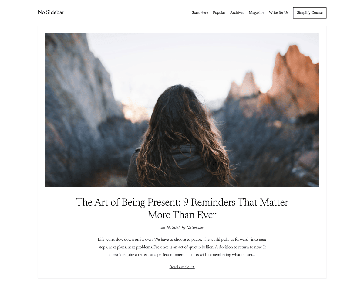No Sidebar home page screenshot with not balanced title
With text-wrap: balance; applied, the difference is clear. Headlines on the homepage wrap more evenly, creating a cleaner, more intentional, and visually balanced look that aligns perfectly with the No Sidebar aesthetic.
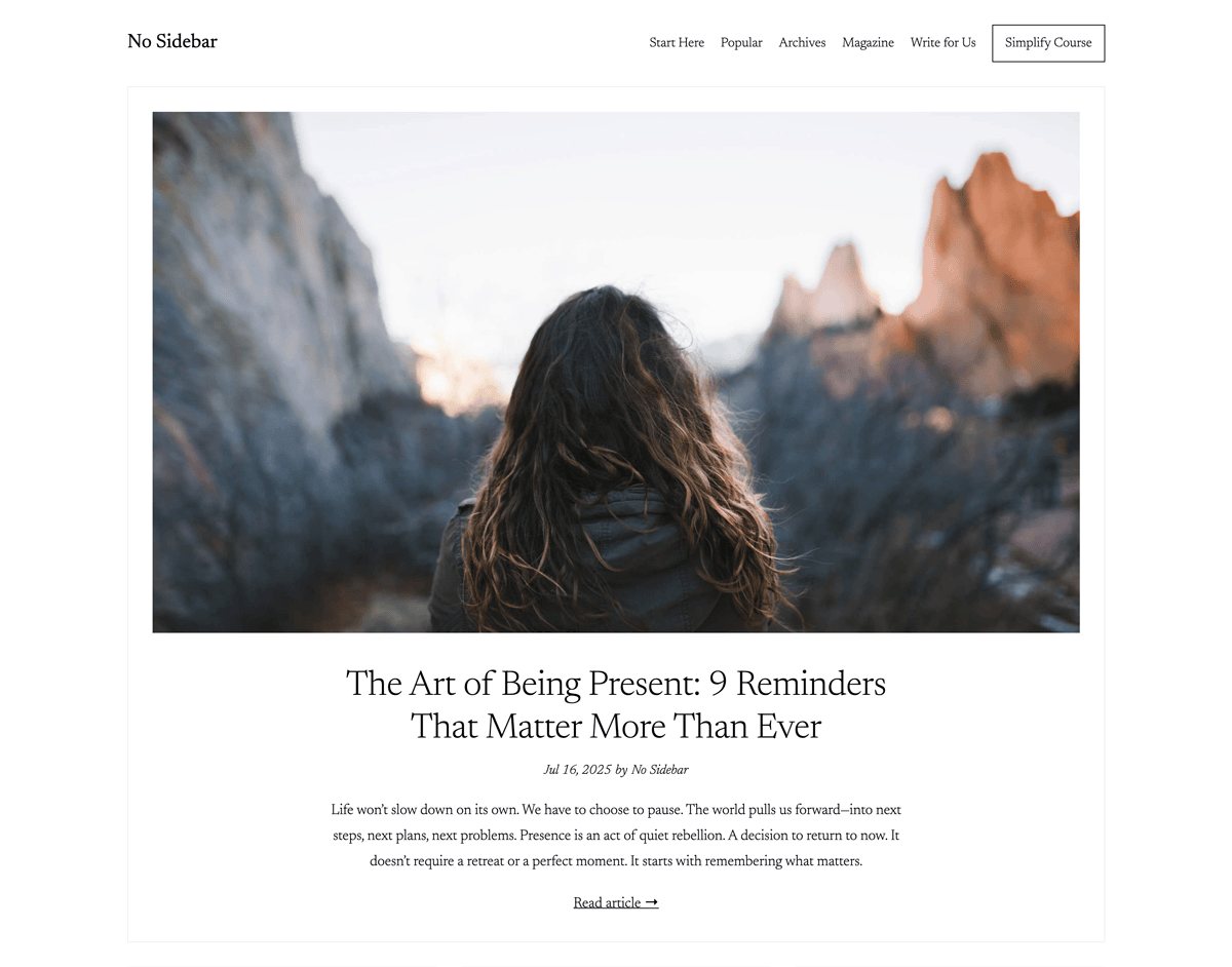No Sidebar home page screenshot with balanced title, Text-Wrap Balance - Brian Gardner, Brian Gardner, 01k0ffkk67f4safr38d09qwc8e.